ok on original, i dont know if you made it or not, but ill critique both
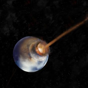
ORIGIONAL
ok, the planet is decent, and the effect is great. i would have had made the clouds either condensing around the impact and have the rest of the world being cloudless, just to ad some nice depth and to exaderate the explosion effect, since it is really nicely done.
also, the terrain seems to be rather blurred, a more realistic planet should have more sharp features to it
also the stars man

, its hard to see from the smallness of them all, but there seems to be some weird "cloudlike" (due to my lack of words atm) effect over them, i dont really like that
also, they seem to be a simple dot filter(omg im forgetting its name atm, and i dont have Photoshop on this comp) with the levels adjusted, real stars tend to group around galaxy's and other celestial forms.
make a couple big black spot somewhere in teh stars for use, then use the clone stamp tool on lighten to add star bunches is areas, make them in groups and swirls, this creates a very ncie effect that will bring the entire image out.
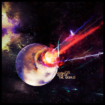
NEW ONE
love the green/yellow and purple, thats great
the blue c4d at the bottom middle to right looks nice
also the other colors in the background look nice
the main thing i dont like is how the bottom purple laser hitting the planet is coming at that weird angle, i think it makes the image look kinda off.
i do really like the color of the planet a great deal, i might make a planet that color in my next space art, it looks great, an I just have to say that purple and yellow/green spot still looks great even when im done with writing all of this

but nice overall, just wish it was a LP,
sry for my spelling, but im posting this b4 i mess it all up, lol