|
|
Silkroad Online
|
|
|
Silkroad Forums
|
|
|
Affiliates
|


|
|
View unanswered posts | View active topics
  |
Page 1 of 1
|
[ 15 posts ] |
|
| Author |
Message |
|
Faiien
|
Post subject: NSR~Flow~Fallen  Posted: Posted: Tue Jan 01, 2008 4:16 pm |
|
| Active Member |
 |
 |
Joined: Oct 2007
Posts: 889
Location:

|
hey guys
so its 2008 happy new years to everyone
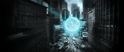
i decided to try some new stuff on photshop and make a new sig
the sigs called Flow
hope you guys like it
this was my first stock sig ^^
enjoi

Last edited by Faiien on Tue Jan 01, 2008 8:14 pm, edited 8 times in total.
|
|
| Top |
|
 |
|
Vibrator
|
Post subject:  Posted: Posted: Tue Jan 01, 2008 5:04 pm |
|
| Active Member |
 |
Joined: Jun 2007
Posts: 946
|
|
On his right cheek there is like some black smudge i dont like it makes it look bleh. but besides that 8.5/10
_________________
<<banned from SRF for remaking a banned account. -SG>>
|
|
| Top |
|
 |
|
Faiien
|
Post subject:  Posted: Posted: Tue Jan 01, 2008 6:39 pm |
|
| Active Member |
 |
 |
Joined: Oct 2007
Posts: 889
Location:

|
oh that was part of the original stock, i had no do in that
i think its just shadows 
|
|
| Top |
|
 |
|
cin
|
Post subject:  Posted: Posted: Tue Jan 01, 2008 6:53 pm |
|
|
|
|
too dark and too monotone imo.
i think what would be GREAT in this sig, is if you would accentuate one or two
spots with some color. like the eyes in Luoma's cat n dog. that way, the sig
will be less plain, less boring, and more fun to look at :] also, if you do that,
the darkness of the sig will be allright i think. right now its just too much black
n white for my taste.
2nd, i like how you tried to fix the text on that spot, i just dont like the font ;]
|
|
| Top |
|
 |
|
Faiien
|
Post subject:  Posted: Posted: Tue Jan 01, 2008 6:57 pm |
|
| Active Member |
 |
 |
Joined: Oct 2007
Posts: 889
Location:

|
|
well the stock was in black and white so i decided to go with a black and white theme. I didnt wanna ruin the stock by sticking in a random color so i kept it a classy black and white.
|
|
| Top |
|
 |
|
cin
|
Post subject:  Posted: Posted: Tue Jan 01, 2008 7:01 pm |
|
|
|
Faiien wrote: well the stock was in black and white so i decided to go with a black and white theme. I didnt wanna ruin the stock by sticking in a random color so i kept it a classy black and white.
well the eyes in Luoma's sigs werent that color either as a stock.. but whatever,
just my opinion on it cause it looks a little plain right now :]
one more thing, maybe add something black-er to the top right corner, because
that area looks very grey compared to the focal, maybe a little too grey ;]
|
|
| Top |
|
 |
|
Faiien
|
Post subject:  Posted: Posted: Tue Jan 01, 2008 7:14 pm |
|
| Active Member |
 |
 |
Joined: Oct 2007
Posts: 889
Location:

|
Quote: well the eyes in Luoma's sigs werent that color either as a stock.. but whatever,
just my opinion on it cause it looks a little plain right now :] the guys eyes were hidden in the stock...so i dont know why you keep talking about eyes....  Quote: ne more thing, maybe add something black-er to the top right corner, because
that area looks very grey compared to the focal, maybe a little too grey ;] thats suppose to be a light source...
|
|
| Top |
|
 |
|
cin
|
Post subject:  Posted: Posted: Tue Jan 01, 2008 7:20 pm |
|
|
|
|
huh.... i could've sworn u had a couple of effects in that top right corner
instead of just that light source of yours... o.o but i must be nuts.... OR you
edited your sig and uploaded it again like.. 10 minuts after the reply i made
about your top right corner?
oh, and if you read the first reply i made in this topic, you would have seen i
took the eyes in luoma's sigs as an example for color accents.
but whatever, last time i commented on your sigs anyway..
|
|
| Top |
|
 |
|
Faiien
|
Post subject:  Posted: Posted: Tue Jan 01, 2008 7:37 pm |
|
| Active Member |
 |
 |
Joined: Oct 2007
Posts: 889
Location:

|
|
the one i have right now is the one i was editing
i dont just post my sig on this forum >_>
on the other gfx forums people said that the lights up there made the sig look grainy so i took them out then i came back here and edited my post.
like is said, where do you want me to stick in a random color on him? he doesnt have any accesories, doesnt show any eyes. It was just a hoodie and his head which was basically it. There were no spots to accentuate any other colors which is why i picked the black and white. Iam editing right now as we speak...or type lol
|
|
| Top |
|
 |
|
WaX
|
Post subject:  Posted: Posted: Tue Jan 01, 2008 7:56 pm |
|
| Banned User |
 |
Joined: Sep 2007
Posts: 659
Location:

|
|
Dont think that text is doing any favours for the sig atm.
_________________
<<banned from SRF for bot admission. -SG>>
|
|
| Top |
|
 |
|
Faiien
|
Post subject:  Posted: Posted: Tue Jan 01, 2008 8:04 pm |
|
| Active Member |
 |
 |
Joined: Oct 2007
Posts: 889
Location:

|
k iam gonna use this as my final version...seriously
sorry for all the confusion

Last edited by Faiien on Tue Jan 01, 2008 8:14 pm, edited 2 times in total.
|
|
| Top |
|
 |
|
0l3n
|
Post subject:  Posted: Posted: Tue Jan 01, 2008 8:12 pm |
|
| Elite Member |
 |
 |
Joined: Jun 2006
Posts: 5185
Location: Artists Corner
|
|
Just add some faint colour spots around the focalpoint, this way you can make the sig less "boring", and id advise you to blur some parts of the sig to add to depth and focal.
_________________
|
|
| Top |
|
 |
|
Faiien
|
Post subject:  Posted: Posted: Tue Jan 01, 2008 8:14 pm |
|
| Active Member |
 |
 |
Joined: Oct 2007
Posts: 889
Location:

|
ill do that next time
thx 
|
|
| Top |
|
 |
|
HOLLAstir
|
Post subject:  Posted: Posted: Tue Jan 01, 2008 11:47 pm |
|
| Loyal Member |
 |
 |
Joined: Aug 2007
Posts: 1637
Location: 206
|
|
I agree with everything that's being said. As a example you could look at the sig I made for fena.
_________________


|
|
| Top |
|
 |
  |
Page 1 of 1
|
[ 15 posts ] |
|
Who is online |
Users browsing this forum: No registered users and 12 guests |
|
You cannot post new topics in this forum
You cannot reply to topics in this forum
You cannot edit your posts in this forum
You cannot delete your posts in this forum
You cannot post attachments in this forum
|
|


