|
|
Silkroad Online
|
|
|
Silkroad Forums
|
|
|
Affiliates
|


|
|
View unanswered posts | View active topics
  |
Page 1 of 1
|
[ 15 posts ] |
|
| Author |
Message |
|
so STOOPS
|
Post subject: [updated] new yoda sig.  Posted: Posted: Tue Dec 18, 2007 12:03 am |
|
| Banned User |
 |
Joined: Dec 2007
Posts: 137
Location:

|
_________________
<<banned from SRF for rules violations: rule #5. -SG>>
Last edited by so STOOPS on Tue Dec 18, 2007 3:10 am, edited 3 times in total.
|
|
| Top |
|
 |
|
christina
|
Post subject: Posted: Tue Dec 18, 2007 1:34 am |
|
| Banned User |
 |
|
Joined: Oct 2007
Posts: 1017
Location:

|
|
better
_________________
<<Left because of dumbshit people like stallowned>>
|
|
| Top |
|
|
|
aazumak
|
Post subject: Posted: Tue Dec 18, 2007 2:30 am |
|
| Active Member |
 |
|
Joined: Jun 2007
Posts: 918
Location:
|
christina wrote: better
exactly
you are getting better, just keep working on it, thats the only way to get it done right
_________________


_____________________!!!!!!Rogue 7X !!!!!!

|
|
| Top |
|
|
|
Faiien
|
Post subject: Posted: Tue Dec 18, 2007 2:41 am |
|
| Active Member |
 |
|
Joined: Oct 2007
Posts: 889
Location:
|
|
repetition is key
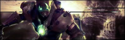
for the first sig try making the gundam less dark so he will fit in better with the bg or the other way around cause atm he sticks out like a sore thumb
|
|
| Top |
|
|
|
CrimsonNuker
|
Post subject: Posted: Tue Dec 18, 2007 3:27 am |
|
| Dom's Slut |
 |
|
Joined: Aug 2006
Posts: 13791
Location:

|
|
Less Contrast.
_________________
|
|
| Top |
|
|
|
so STOOPS
|
Post subject: Posted: Tue Dec 18, 2007 3:34 am |
|
| Banned User |
|
Joined: Dec 2007
Posts: 137
Location:
|
CrimsonNuker wrote: Less Contrast.
what's contrast? and how do i lower it?
_________________
<<banned from SRF for rules violations: rule #5. -SG>>
|
|
| Top |
|
|
|
HOLLAstir
|
Post subject: Posted: Tue Dec 18, 2007 3:36 am |
|
| Loyal Member |
 |
|
Joined: Aug 2007
Posts: 1637
Location: 206
|
|
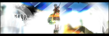
The text on your "yoda" one would look better without the mirror effect.
_________________


|
|
| Top |
|
|
|
Faiien
|
Post subject: Posted: Tue Dec 18, 2007 3:38 am |
|
| Active Member |
|
|
Joined: Oct 2007
Posts: 889
Location:
|
|
contrast
image>adjustments>brightness/contrast
|
|
| Top |
|
|
|
SuicideGrl
|
Post subject: Posted: Wed Dec 19, 2007 12:56 pm |
|
| Retired Admin |
 |
|
Joined: Jan 2006
Posts: 8004
Location: World of Warcraft
|
HOLLAstir wrote: The text on your "yoda" one would look better without the mirror effect.
+1, and a border that was less thick would help too, imo... or at least lowering the opacity of the one you have.
_________________

Thx IceCrash for my awesome sig :)
SRF Name Change Policy
Having trouble accessing SRF?
dom wrote: RuYi wrote: Are you from outer space or something? He's from Jersey. Close enough.
|
|
| Top |
|
|
|
MrBow
|
Post subject: Posted: Wed Dec 19, 2007 1:12 pm |
|
| Ex-Staff |
 |
|
Joined: Jan 2007
Posts: 2979
Location: Playin' Talkin'
|
SuicideGrl wrote: HOLLAstir wrote: The text on your "yoda" one would look better without the mirror effect. +1, and a border that was less thick would help too, imo... or at least lowering the opacity of the one you have. +1
Maybe a different border on the yoda sig, i don't like the left side, it's too bright 
_________________
Niyoke wrote: err i know ium soudning weird but .. Mr Bow is my p.e teacher .. ARE YOU MR BOW? LMAO ?
|
|
| Top |
|
|
|
Swindler
|
Post subject: Posted: Sat Dec 22, 2007 2:45 pm |
|
| Forum God |
 |
|
Joined: Apr 2007
Posts: 11256
Location: Pimpas Paradise.
|
i like it 
|
|
| Top |
|
|
|
Rizla
|
Post subject: Posted: Sat Dec 22, 2007 2:53 pm |
|
| Ex-Staff |
 |
|
Joined: Jun 2006
Posts: 1197
Location: Artist's Corner
|
HOLLAstir wrote: The text on your "yoda" one would look better without the mirror effect.
I totally agree, and even if you want to keep the reflection effect, you need to make a gradient selection, reflections grow stronger (or weaker) in intensity along the plane in which they exist. I would also recomend moving the reflection closer to the source text.
But as HOLLAstir (btw hi dont know you yet) said it would look better if you omitted it altogether.
_________________

|
|
| Top |
|
|
|
CrimsonNuker
|
Post subject: Posted: Sat Dec 22, 2007 3:05 pm |
|
| Dom's Slut |
|
|
Joined: Aug 2006
Posts: 13791
Location:
|
Rizla wrote: HOLLAstir wrote: The text on your "yoda" one would look better without the mirror effect. I totally agree, and even if you want to keep the reflection effect, you need to make a gradient selection, reflections grow stronger (or weaker) in intensity along the plane in which they exist. I would also recomend moving the reflection closer to the source text. But as HOLLAstir (btw hi dont know you yet) said it would look better if you omitted it altogether. I Miss You. 
_________________
|
|
| Top |
|
|
|
Rizla
|
Post subject: Posted: Sat Dec 22, 2007 3:07 pm |
|
| Ex-Staff |
|
|
Joined: Jun 2006
Posts: 1197
Location: Artist's Corner
|
CrimsonNuker wrote: Rizla wrote: HOLLAstir wrote: The text on your "yoda" one would look better without the mirror effect. I totally agree, and even if you want to keep the reflection effect, you need to make a gradient selection, reflections grow stronger (or weaker) in intensity along the plane in which they exist. I would also recomend moving the reflection closer to the source text. But as HOLLAstir (btw hi dont know you yet) said it would look better if you omitted it altogether. I Miss You. I just tried to message you on MSN 
_________________
|
|
| Top |
|
|
|
|
Page 1 of 1
|
[ 15 posts ] |
|
Who is online |
Users browsing this forum: No registered users and 6 guests |
|
You cannot post new topics in this forum
You cannot reply to topics in this forum
You cannot edit your posts in this forum
You cannot delete your posts in this forum
You cannot post attachments in this forum
|
|