|
|
Silkroad Online
|
|
|
Silkroad Forums
|
|
|
Affiliates
|


|
|
View unanswered posts | View active topics
  |
Page 1 of 1
|
[ 16 posts ] |
|
| Author |
Message |
|
HOLLAstir
|
Post subject: New Sig: Serenity  Posted: Posted: Mon Dec 17, 2007 8:27 am |
|
| Loyal Member |
 |
 |
Joined: Aug 2007
Posts: 1637
Location: 206
|
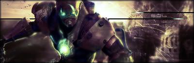
Took your advice broken, worked on my light source, used a lens flare. Dodge and burned her face. First time using clipping masks. A lot of smudging, and a c4d thrown in there. Tried a new border. Lot's of gradients, tried to keep the simplicity vibe yet at the same time random and curious.
c/c <3

_________________


|
|
| Top |
|
 |
|
Faiien
|
Post subject: Posted: Mon Dec 17, 2007 8:31 am |
|
| Active Member |
 |
|
Joined: Oct 2007
Posts: 889
Location:

|
|
best sig you've made so far
the clipping masks and light source add alot of depth to your picture
good job!
|
|
| Top |
|
|
|
christina
|
Post subject: Posted: Mon Dec 17, 2007 8:44 am |
|
| Banned User |
 |
|
Joined: Oct 2007
Posts: 1017
Location:
|
Faiien wrote: best sig you've made so far
the clipping masks and light source add alot of depth to your picture
good job!
+1
_________________
<<Left because of dumbshit people like stallowned>>
|
|
| Top |
|
|
|
BrokenSaint
|
Post subject: Posted: Mon Dec 17, 2007 9:37 am |
|
| Veteran Member |
 |
|
Joined: Jan 2006
Posts: 3473
Location: Stuntin'.
|
|
Very nice. If you did that to your trapped sig im sure it would look good too. Good job.
_________________
|
|
| Top |
|
|
|
Faiien
|
Post subject: Posted: Mon Dec 17, 2007 1:29 pm |
|
| Active Member |
|
|
Joined: Oct 2007
Posts: 889
Location:
|
|
ya just those two things alone give your sig alot of flow
|
|
| Top |
|
|
|
HOLLAstir
|
Post subject: Posted: Mon Dec 17, 2007 7:31 pm |
|
| Loyal Member |
|
|
Joined: Aug 2007
Posts: 1637
Location: 206
|
|
Yeah, Took me a while to get used to clipping masks. Any other comments?
_________________
|
|
| Top |
|
|
|
aazumak
|
Post subject: Posted: Mon Dec 17, 2007 7:40 pm |
|
| Active Member |
 |
|
Joined: Jun 2007
Posts: 918
Location:
|
HOLLAstir wrote: Yeah, Took me a while to get used to clipping masks. Any other comments?
is that what it is, clipping masks? i thought it was the stamp tool, either way its ill, great sig, i love sigs with clipping masks in em
_________________


_____________________!!!!!!Rogue 7X !!!!!!

|
|
| Top |
|
|
|
HOLLAstir
|
Post subject: Posted: Mon Dec 17, 2007 7:43 pm |
|
| Loyal Member |
|
|
Joined: Aug 2007
Posts: 1637
Location: 206
|
aazumak wrote: HOLLAstir wrote: Yeah, Took me a while to get used to clipping masks. Any other comments? is that what it is, clipping masks? i thought it was the stamp tool, either way its ill, great sig, i love sigs with clipping masks in em Yeah clipping masks. I'm liking it more, helps add "flow" at times.
_________________
|
|
| Top |
|
|
|
0l3n
|
Post subject: Posted: Mon Dec 17, 2007 7:56 pm |
|
| Elite Member |
 |
|
Joined: Jun 2006
Posts: 5185
Location: Artists Corner
|
|
Try sharpening the render a bit to add to the focal, and text look soft to me, id put the "name" closer to the "title".
_________________
|
|
| Top |
|
|
|
HOLLAstir
|
Post subject: Posted: Mon Dec 17, 2007 8:02 pm |
|
| Loyal Member |
|
|
Joined: Aug 2007
Posts: 1637
Location: 206
|
|
I was going for "soft." It looks like she's wondering something, thinking. So I wanted the text to be really simple and soft to correlate with that. Yeah I sharpened it, I guess I could have done it once more, but it looked a little "over" sharpened with I did it again. Anyways thanks for the comments as always <3
_________________
|
|
| Top |
|
|
|
so STOOPS
|
Post subject: Posted: Tue Dec 18, 2007 12:11 am |
|
| Banned User |
|
Joined: Dec 2007
Posts: 137
Location:

|
|
how do you make those funky lines? are they just brushes with different settings and colors?
_________________
<<banned from SRF for rules violations: rule #5. -SG>>
|
|
| Top |
|
|
|
fena
|
Post subject: Posted: Tue Dec 18, 2007 2:29 am |
|
| Ex-Staff |
 |
|
Joined: May 2007
Posts: 4441
Location: Life
|
|
I love it. Personally, I think it's your best one before.
First of all, I absolutely love the use of colors. The bright colors on the right and the more basic brown on the left create a real feeling of serenity, hence the name of the Sig.
Also love the render. First perfectly in with the mood you were going for.
The only thing that I SLIGHTLY don't like is the guy's hood on the very left. It's starting to blur a bit, and for some reason, contrasted with the very solid right side of the render (his face), it looks slightly strange. Like he was smeared a bit.
Still, I absolutely love the Sig. Nothing much else to say. 10/10 from me!
|
|
| Top |
|
|
|
HOLLAstir
|
Post subject: Posted: Tue Dec 18, 2007 3:06 am |
|
| Loyal Member |
|
|
Joined: Aug 2007
Posts: 1637
Location: 206
|
|
Thanks fena! <3 you. Anyways yeah I smudged quite a bit on the hood tried to get the feeling like it was being pulled away so it would go with the brushing and clipping masks. I see what you mean though. It was just the style I was going for, I could have made the smearing a bit more gradual. Anyways thanks for the comments as always guys <3
_________________
|
|
| Top |
|
|
|
HOLLAstir
|
Post subject: Posted: Tue Dec 18, 2007 8:55 am |
|
| Loyal Member |
|
|
Joined: Aug 2007
Posts: 1637
Location: 206
|
so STOOPS wrote: how do you make those funky lines? are they just brushes with different settings and colors?
Which funky lines? I think I know what you mean, and I used a certain brush and smudged with it on high scatter.
_________________
|
|
| Top |
|
|
|
Rizla
|
Post subject: Posted: Sat Dec 22, 2007 4:42 pm |
|
| Ex-Staff |
 |
|
Joined: Jun 2006
Posts: 1197
Location: Artist's Corner
|
|
A complimenting effect to the masks would help balance the piece.
_________________

|
|
| Top |
|
|
|
|
Page 1 of 1
|
[ 16 posts ] |
|
Who is online |
Users browsing this forum: No registered users and 4 guests |
|
You cannot post new topics in this forum
You cannot reply to topics in this forum
You cannot edit your posts in this forum
You cannot delete your posts in this forum
You cannot post attachments in this forum
|
|