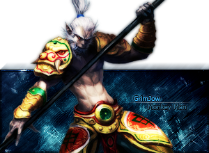
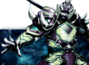
binnosh wrote:
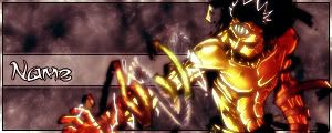
just a question bout the last one, is the render it's self soo blurry?
i like shapr renders myself, and i think it might look better a bit sharpened
oh haha i thought you were talking about the usertags...not the three to choose from

but if you mean blurry as in it looks like it was feathered then yeah it came that way...i spent like 45 minutes trying to make it blend it with the sig...yellow and blue do not mix >.>
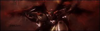
http://i7.tinypic.com/6x0cl01.pngaazumak wrote:
i feel that if the 4th one, the gundam on e was less blurry and brighter, that would be the best
and as said before, pop out sigs shouldn't be cut off whatsoever
yeah that one was like my third atempt at smudging...im seriously bad at it...but thanks ill see what i can do


