|
|
Silkroad Online
|
|
|
Silkroad Forums
|
|
|
Affiliates
|


|
|
View unanswered posts | View active topics
  |
Page 1 of 1
|
[ 11 posts ] |
|
| Author |
Message |
|
runtypoo
|
Post subject: NSR~  Posted: Posted: Wed Sep 12, 2007 10:43 am |
|
| Casual Member |
 |
 |
Joined: Jan 2007
Posts: 83
Location: Australia
|

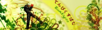
got cs3.
made a sprite:)
comment and criticise
_________________

|
|
| Top |
|
 |
|
cin
|
Post subject: Posted: Wed Sep 12, 2007 11:12 am |
|
|
|
just a quick comment.. try put a lighting effect on it, for example a spotlight
bright in the top left, dark in the bottom right... i think after that i will like it. 
|
|
| Top |
|
|
|
Snudge
|
Post subject: Posted: Wed Sep 12, 2007 7:02 pm |
|
| Banned User |
|
Joined: Jun 2006
Posts: 4200
Location:

|
cin wrote: just a quick comment.. try put a lighting effect on it, for example a spotlight bright in the top left, dark in the bottom right... i think after that i will like it. You're not supposed to like sprites. 
Looks good, Runtypoo.
_________________
<<banned from SRF for proof of botting. -SG>>
|
|
| Top |
|
|
|
runtypoo
|
Post subject: Posted: Wed Sep 12, 2007 8:58 pm |
|
| Casual Member |
|
|
Joined: Jan 2007
Posts: 83
Location: Australia
|
|
| Top |
|
|
|
Dugu
|
Post subject: Posted: Thu Sep 13, 2007 12:12 am |
|
| Casual Member |
 |
|
Joined: Jul 2007
Posts: 64
Location: Come find me
|
|
Went too far on lighting effects and not enough on others.
The colors you choose were a sort of happy cynical, which is my way of saying cold colors w/o black. Although they match your sprite, the colors near the sprite itself does not make your render stand out.
The light-------->dark contrast that you're going for is there and I can plainly see it, but it's just an "eh". While the brush strokes/smudge or however your did your color is nice, it needs to have a direction, not necessarily flow, but some sort of recognizable organization. Even if it's random and chaotic, unless your just splatting brushes against a white canvas, you want people to look at it and say "AHHH, that's chaotic, cool." Right now yours screams nice colors, vivid, effects, and text & render.
The light source you chose does not carry over to your render for some strange reason, nor your text. You need to work on making a focal THE focal, not "hey, that's nice, that's nice too, and that one" to a more "WOW!!! and the background effects are good too!"
Your render looks a bit over sharpened, which would not be a problem against a smudged background, but you seemed to have sharpened around the edge of the render onto the background.
I mentioned text there but I'll say it again, after viewers are done with the big picture and first impressions they want to see things like text and render clearly.
Random yellow bar to the top-left of your render, dunno why that's there.
Definitely sig worthy.
_________________
Charles Caleb Colton wrote: We hate some persons because we do not know them; and will not know them because we hate them.

|
|
| Top |
|
|
|
Rizla
|
Post subject: Posted: Thu Sep 13, 2007 3:59 am |
|
| Ex-Staff |
 |
|
Joined: Jun 2006
Posts: 1197
Location: Artist's Corner
|
|
Dugus back? wherefore art though dugu? stay with us!
_________________

|
|
| Top |
|
|
|
Dugu
|
Post subject: Posted: Fri Sep 14, 2007 1:45 am |
|
| Casual Member |
|
|
Joined: Jul 2007
Posts: 64
Location: Come find me
|
|
I've been trying to cap my level 69 Chinese bladder, and college is back in session soon so I'll have to move back on campus, all in all not much time for SRF and AC, but I still post now and then.
Nice to see you're a moderator now Rizla, you deserve it.
_________________
Charles Caleb Colton wrote: We hate some persons because we do not know them; and will not know them because we hate them.
|
|
| Top |
|
|
|
doa_master0
|
Post subject: Posted: Fri Sep 14, 2007 3:20 am |
|
| Regular Member |
 |
|
Joined: May 2006
Posts: 237
Location:

|
Dugu wrote: Went too far on lighting effects and not enough on others.
The colors you choose were a sort of happy cynical, which is my way of saying cold colors w/o black. Although they match your sprite, the colors near the sprite itself does not make your render stand out.
The light-------->dark contrast that you're going for is there and I can plainly see it, but it's just an "eh". While the brush strokes/smudge or however your did your color is nice, it needs to have a direction, not necessarily flow, but some sort of recognizable organization. Even if it's random and chaotic, unless your just splatting brushes against a white canvas, you want people to look at it and say "AHHH, that's chaotic, cool." Right now yours screams nice colors, vivid, effects, and text & render.
The light source you chose does not carry over to your render for some strange reason, nor your text. You need to work on making a focal THE focal, not "hey, that's nice, that's nice too, and that one" to a more "WOW!!! and the background effects are good too!"
Your render looks a bit over sharpened, which would not be a problem against a smudged background, but you seemed to have sharpened around the edge of the render onto the background.
I mentioned text there but I'll say it again, after viewers are done with the big picture and first impressions they want to see things like text and render clearly.
Random yellow bar to the top-left of your render, dunno why that's there.
Definitely sig worthy.
FIRST OF ALL
What Does Sprite actually mean!!! I thought it meant moving image
I hate this Guy... How do u even know about Focal Points and Organizing Paints.... All i really do is "ooh this looks good".. and "oh right there ill leave that there , it fits" i dont really plan anything i Dont know how to I feel So behind.... Garsh!
_________________
Cut, Copy, Paste, Art Kung Fu ^_^ 

^^Thanks a Bunch to Cin^^
|
|
| Top |
|
|
|
rek
|
Post subject: Posted: Fri Sep 14, 2007 8:05 am |
|
| Ex-Staff |
 |
|
Joined: Dec 2006
Posts: 5607
Location: darkroot garden
|
doa_master0 wrote: Dugu wrote: Went too far on lighting effects and not enough on others.
The colors you choose were a sort of happy cynical, which is my way of saying cold colors w/o black. Although they match your sprite, the colors near the sprite itself does not make your render stand out.
The light-------->dark contrast that you're going for is there and I can plainly see it, but it's just an "eh". While the brush strokes/smudge or however your did your color is nice, it needs to have a direction, not necessarily flow, but some sort of recognizable organization. Even if it's random and chaotic, unless your just splatting brushes against a white canvas, you want people to look at it and say "AHHH, that's chaotic, cool." Right now yours screams nice colors, vivid, effects, and text & render.
The light source you chose does not carry over to your render for some strange reason, nor your text. You need to work on making a focal THE focal, not "hey, that's nice, that's nice too, and that one" to a more "WOW!!! and the background effects are good too!"
Your render looks a bit over sharpened, which would not be a problem against a smudged background, but you seemed to have sharpened around the edge of the render onto the background.
I mentioned text there but I'll say it again, after viewers are done with the big picture and first impressions they want to see things like text and render clearly.
Random yellow bar to the top-left of your render, dunno why that's there.
Definitely sig worthy. FIRST OF ALLWhat Does Sprite actually mean!!! I thought it meant moving image I hate this Guy... How do u even know about Focal Points and Organizing Paints.... All i really do is "ooh this looks good".. and "oh right there ill leave that there , it fits" i dont really plan anything i Dont know how to I feel So behind.... Garsh! The use of "." helps. And try not to put random capital letters in the middle of what ur saying.
_________________

<3
0len
|
|
| Top |
|
|
|
Snudge
|
Post subject: Posted: Fri Sep 14, 2007 3:05 pm |
|
| Banned User |
|
Joined: Jun 2006
Posts: 4200
Location:
|
doa_master0 wrote: FIRST OF ALL
What Does Sprite actually mean!!! I thought it meant moving image
I hate this Guy... How do u even know about Focal Points and Organizing Paints.... All i really do is "ooh this looks good".. and "oh right there ill leave that there , it fits" i dont really plan anything i Dont know how to I feel So behind.... Garsh!
Sprite [In 'signature land' that is] means a small bitmap image, often taken from moving GIF's which fits completely within the borders of the sig.
Well, that's my interpretation.
_________________
<<banned from SRF for proof of botting. -SG>>
|
|
| Top |
|
|
|
|
Page 1 of 1
|
[ 11 posts ] |
|
Who is online |
Users browsing this forum: No registered users and 6 guests |
|
You cannot post new topics in this forum
You cannot reply to topics in this forum
You cannot edit your posts in this forum
You cannot delete your posts in this forum
You cannot post attachments in this forum
|
|

