|
|
Silkroad Online
|
|
|
Silkroad Forums
|
|
|
Affiliates
|


|
|
View unanswered posts | View active topics
  |
Page 1 of 1
|
[ 11 posts ] |
|
|
0l3n
|
Post subject:  Posted: Posted: Tue Aug 21, 2007 7:22 pm |
|
| Elite Member |
 |
 |
Joined: Jun 2006
Posts: 5185
Location: Artists Corner
|
|
I think the pentooling is to big, but the rest is quite nice.
_________________
|
|
| Top |
|
 |
|
Knuckles
|
Post subject: Posted: Tue Aug 21, 2007 7:29 pm |
|
| Common Member |
 |
|
Joined: May 2006
Posts: 130
Location:

|
|
What do you mean by pen tooling?
_________________
| Atlas | Oasis | 2x Str Hybrid Fire Blader | Farming: 20k / 370k SP |

|
|
| Top |
|
|
|
cin
|
Post subject: Posted: Tue Aug 21, 2007 7:31 pm |
|
|
|
|
he means the glowy lines me thinks.
if so, i agree with him on that. they kind of overrule the rest of the sig.
and one more thing.. i like the movie border, but you could have put more
depth in the sig if you for example put a part of your borders behind the
glowy lines or something. the sig looks a bit flat this way because the border
is layed over the complete thing.
|
|
| Top |
|
|
|
0l3n
|
Post subject: Posted: Tue Aug 21, 2007 7:31 pm |
|
| Elite Member |
|
|
Joined: Jun 2006
Posts: 5185
Location: Artists Corner
|
|
The glowing lines.
_________________
|
|
| Top |
|
|
|
Knuckles
|
Post subject: Posted: Tue Aug 21, 2007 7:36 pm |
|
| Common Member |
|
|
Joined: May 2006
Posts: 130
Location:
|
|
Yeah, I tried to go for the look of the glow-lines sort of weaving in and out of the film border thing, but couldn't quite get it right, same with the lines. They were a bit too big, and I tried to make them smaller lol, but it's hard to get the right curve with such a small line
_________________
| Atlas | Oasis | 2x Str Hybrid Fire Blader | Farming: 20k / 370k SP |
|
|
| Top |
|
|
|
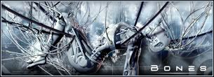
Bones
|
Post subject: Posted: Tue Aug 21, 2007 7:51 pm |
|
| Casual Member |
|
Joined: Aug 2007
Posts: 63
Location:
|
|
| Top |
|
|
|
BrokenSaint
|
Post subject: Posted: Tue Aug 21, 2007 10:14 pm |
|
| Veteran Member |
 |
|
Joined: Jan 2006
Posts: 3473
Location: Stuntin'.
|
|
I could've sworn I saw that as a vector wallpaper on deviantART. If you guys did take it from there, shouldn't you be asking for permission to use it? Unless it has the Creative Commons License, at least give credits to the author unless the CC states no derivative works.
_________________
|
|
| Top |
|
|
|
0l3n
|
Post subject: Posted: Tue Aug 21, 2007 10:18 pm |
|
| Elite Member |
|
|
Joined: Jun 2006
Posts: 5185
Location: Artists Corner
|
BrokenSaint wrote: I could've sworn I saw that as a vector wallpaper on deviantART. If you guys did take it from there, shouldn't you be asking for permission to use it? Unless it has the Creative Commons License, at least give credits to the author unless the CC states no derivative works.
What the guy and the girl?
_________________
|
|
| Top |
|
|
|
Knuckles
|
Post subject: Posted: Tue Aug 21, 2007 10:20 pm |
|
| Common Member |
|
|
Joined: May 2006
Posts: 130
Location:
|
|
Nope, It's just a black ellipse for the hill, and the two people are a preset brush. The white sparklies, and stuff are just white brushing set to soft light, and with outer glow on the sparklies.
Not ripped.
_________________
| Atlas | Oasis | 2x Str Hybrid Fire Blader | Farming: 20k / 370k SP |
|
|
| Top |
|
|
|
Rizla
|
Post subject: Posted: Tue Aug 21, 2007 10:32 pm |
|
| Ex-Staff |
 |
|
Joined: Jun 2006
Posts: 1197
Location: Artist's Corner
|
|
Looking like the start to a solid piece. Im not digging the visitor text because its edged and because it conflicts with the "fall."
ditch the corder and the collaboration text imo.
the stroke is a 'tad' awkward, but not to the point that I would give it formal criticism, the feeling I get is minute to the point that I believe it could be purely subjective.
So yeah besides the border/collab text I really like it. Close to sexy.
edit-
I figured out why I hated the border. If that was a filmstrip, each frame of it would look the same to our eyes. ( well very close to the same if it were recorded for 29.97 FPS)
_________________

|
|
| Top |
|
|
|
|
Page 1 of 1
|
[ 11 posts ] |
|
Who is online |
Users browsing this forum: No registered users and 6 guests |
|
You cannot post new topics in this forum
You cannot reply to topics in this forum
You cannot edit your posts in this forum
You cannot delete your posts in this forum
You cannot post attachments in this forum
|
|