Necro-Mage wrote:
Hey guys!
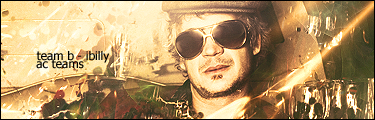
I made my first sig! I used AvAlAnChE1's guide for my sig base and used Moogie's cut out character guide for my stock.
My stock:
http://screenshots.teamxbox.com/screen/61640/Halo-3/Yes, BTW it's another Halo sig

.
So I'm ready for some criticism/comments and ratings, hope it's not too bad

.

Well it's definitely better than your old sig... lol.
It needs some work, I can definitely tell its your first. First clue is the text, and the emboss effect, stay away from that. To you, right now your impressed with that effect. I'll tell you the truth though, its not the amount of effects that you put into your text, but its the way it complements the actual sig. I suggest simplicity.
BTW kudos for the text location, you've got the right idea there.
Another thing, the subject doesn't fit well with the background, in fact it seems rather misplaced. I suggest finding something that complements master chief, try looking up some tutorials on google for blending the subject into the background (of course its not as simple as that, the sig I made below took an hour to evolve to what you see now) - it will look a lot better.
Finally, stay away from that nasty glow effect you used on the text and master chief, honestly it doesn't look good at all, especially in its default yellow setting.
Other than that, huge step up from your old sig haha but i doubt you tried for that one. Keep going at it, it just takes time. I have never used a tutorial for any of my work, ever. I have always taught myself how to use the program, who knows, that may work best for you too.
keep at it ^_^