|
|
Silkroad Online
|
|
|
Silkroad Forums
|
|
|
Affiliates
|


|
|
View unanswered posts | View active topics
  |
Page 1 of 1
|
[ 28 posts ] |
|
| Author |
Message |
|
Snudge
|
Post subject: Aiight...! :D  Posted: Posted: Mon Jun 11, 2007 12:41 pm |
|
| Banned User |
 |
Joined: Jun 2006
Posts: 4200
Location:

|
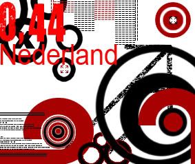
Aight, for school I need to design a stamp. The only problem, I got not farking clue where to start. Could you guys perhaps give me a base to begin with? I'll post the assignment here.
Quote: TGP Postal Services(Dutch company ^^') wnats a new series of stamps. They asked you to make a design for a series of 3 stamps.
They didn't find a good subject themselves yet, so it's up to you which theme belongs to this series of stamps. One must be able to see these stamps belong together, but all 3 of them have to be different.
The value( €0,44; €0,88; €1,32) has to be visible, along with the word "Nederland'(Netherlands)
Working Method;
- Collect material as inspiration source for your theme.
- Make 1 or more 'collages'(Is that an english word as well? >.>) with the material you collected
- Collect a few different stamps or images of stamps
- Make a few sketches in which you try several ideas. (Think of the tekst as well)
- Make a choice from your sketches, and work these out to a series of 3 stamps.
What you have to, and may;
- All stamps must have the same size.
- Allignment of characters and numbers on the stamps and size of the text has to be well-considered.
- It's up to you which material you use.
- Stamps have to be presentated 4 times bigger then a real stamp.
- Stamps have to be presentated neatly.(>.<?)
- Sketches of stamps hav to be presentated neatly.
- Collages of the collected material on the theme has to be presentated neatly.
I got no clue where to start. I thought of a more 'modern' theme perhaps music or gaming. Bad thing is, I don't like to sketch. I just want to go. This is the first time I'm afraid I will have to sketch :< Halp?
Wee, first two are here.
[/img]
Forgot something 
Fix'd empty-ess.. sorta..
Green or Blue?:
And number three :>
Small versions;

2

2²

Green or blue?:


_________________
<<banned from SRF for proof of botting. -SG>>
Last edited by Snudge on Tue Jun 12, 2007 7:36 pm, edited 10 times in total.
|
|
| Top |
|
 |
|
Rizla
|
Post subject: Posted: Mon Jun 11, 2007 1:03 pm |
|
| Ex-Staff |
 |
|
Joined: Jun 2006
Posts: 1197
Location: Artist's Corner
|
go with simple, easy categories, fruit - automobiles - kitchen appliances - beverages - etc. Collage is a word in english as well 
_________________

|
|
| Top |
|
|
|
0l3n
|
Post subject: Posted: Mon Jun 11, 2007 2:26 pm |
|
| Elite Member |
 |
|
Joined: Jun 2006
Posts: 5185
Location: Artists Corner
|
Id go with a vector-looking stamp with a bunch of vectored cars and airplanes. Wouldnt make the vector to thick like in rizlas avatar though.
Than after your done try a black/white gradientmap set on darken to make the colors more dull.
Thats just my 2 cents 
_________________
|
|
| Top |
|
|
|
Snudge
|
Post subject: Posted: Mon Jun 11, 2007 2:30 pm |
|
| Banned User |
|
Joined: Jun 2006
Posts: 4200
Location:
|
0l3n wrote: Id go with a vector-looking stamp with a bunch of vectored cars and airplanes. Wouldnt make the vector to thick like in rizlas avatar though. Than after your done try a black/white gradientmap set on darken to make the colors more dull. Thats just my 2 cents You read my thought :o Was just working on something vector..like..
_________________
<<banned from SRF for proof of botting. -SG>>
|
|
| Top |
|
|
|
Snudge
|
Post subject: Posted: Mon Jun 11, 2007 4:42 pm |
|
| Banned User |
|
Joined: Jun 2006
Posts: 4200
Location:
|
That's what I got for now, any tips? Perhaps on the text? =/
Do remember, this should be 2,5x2,1 cm ^^'
_________________
<<banned from SRF for proof of botting. -SG>>
|
|
| Top |
|
|
|
Waisha
|
Post subject: Posted: Mon Jun 11, 2007 5:12 pm |
|
| Banned User |
|
Joined: Apr 2006
Posts: 3216
Location: wat
|
looks oldschool. 
_________________
<<banned from SRF for rules violations. -SG>>
|
|
| Top |
|
|
|
SuicideGrl
|
Post subject: Posted: Mon Jun 11, 2007 5:40 pm |
|
| Retired Admin |
 |
|
Joined: Jan 2006
Posts: 8004
Location: World of Warcraft
|
Snudge wrote: That's what I got for now, any tips? Perhaps on the text? =/
Do remember, this should be 2,5x2,1 cm ^^'
there's a LOT of detail on this that will be completely lost at the final size. i love it though.
_________________

Thx IceCrash for my awesome sig :)
SRF Name Change Policy
Having trouble accessing SRF?
dom wrote: RuYi wrote: Are you from outer space or something? He's from Jersey. Close enough.
|
|
| Top |
|
|
|
Waisha
|
Post subject: Posted: Mon Jun 11, 2007 5:45 pm |
|
| Banned User |
|
Joined: Apr 2006
Posts: 3216
Location: wat
|
SuicideGrl wrote: Snudge wrote: That's what I got for now, any tips? Perhaps on the text? =/
Do remember, this should be 2,5x2,1 cm ^^' there's a LOT of detail on this that will be completely lost at the final size. i love it though. tell us about the new mod's etc. ^^
_________________
<<banned from SRF for rules violations. -SG>>
|
|
| Top |
|
|
|
CrimsonNuker
|
Post subject: Posted: Mon Jun 11, 2007 6:59 pm |
|
| Dom's Slut |
 |
|
Joined: Aug 2006
Posts: 13791
Location:

|
|
isnt it Netherland?
_________________
|
|
| Top |
|
|
|
Snudge
|
Post subject: Posted: Mon Jun 11, 2007 7:14 pm |
|
| Banned User |
|
Joined: Jun 2006
Posts: 4200
Location:
|
CrimsonNuker wrote: isnt it Netherland? Well, it's for a Dutch school and it's not supposed to be in english, soo SuicideGrl wrote: Snudge wrote: That's what I got for now, any tips? Perhaps on the text? =/
Do remember, this should be 2,5x2,1 cm ^^' there's a LOT of detail on this that will be completely lost at the final size. i love it though. The small 'text' and the lines, yes, the detail gets more or less lost, but the main idea is still here. And btw, I do have to design them this way.
_________________
<<banned from SRF for proof of botting. -SG>>
|
|
| Top |
|
|
|
SuicideGrl
|
Post subject: Posted: Tue Jun 12, 2007 2:56 am |
|
| Retired Admin |
|
|
Joined: Jan 2006
Posts: 8004
Location: World of Warcraft
|
Waisha wrote: tell us about the new mod's etc. ^^
not a chance, gotta wait till the official announcement ;) only a few more days.
_________________
Thx IceCrash for my awesome sig :)
SRF Name Change Policy
Having trouble accessing SRF?
dom wrote: RuYi wrote: Are you from outer space or something? He's from Jersey. Close enough.
|
|
| Top |
|
|
|
fena
|
Post subject: Posted: Tue Jun 12, 2007 4:10 am |
|
| Ex-Staff |
 |
|
Joined: May 2007
Posts: 4441
Location: Life
|
SuicideGrl wrote: Waisha wrote: tell us about the new mod's etc. ^^ not a chance, gotta wait till the official announcement only a few more days. Days? Surely, you mean hours?
I mean, how long does it take to decide over a few Flags? It's actually a pretty simple decision. I'm surprised that it's taken you so long to pick it, because it's obvious that mine's the best from the very beginning.
Or do you not like mine? 
|
|
| Top |
|
|
|
[SD]happynoobing
|
Post subject: Posted: Tue Jun 12, 2007 4:13 am |
|
| Advanced Member |
 |
|
Joined: Jan 2007
Posts: 2349
Location:

|
FenaCorp wrote: SuicideGrl wrote: Waisha wrote: tell us about the new mod's etc. ^^ not a chance, gotta wait till the official announcement only a few more days. Days? Surely, you mean hours? I mean, how long does it take to decide over a few Flags? It's actually a pretty simple decision. I'm surprised that it's taken you so long to pick it, because it's obvious that mine's the best from the very beginning. Or do you not like mine? CN better win. 
_________________

|
|
| Top |
|
|
|
SuicideGrl
|
Post subject: Posted: Tue Jun 12, 2007 5:39 am |
|
| Retired Admin |
|
|
Joined: Jan 2006
Posts: 8004
Location: World of Warcraft
|
FenaCorp wrote: Days? Surely, you mean hours?
I mean, how long does it take to decide over a few Flags? It's actually a pretty simple decision. I'm surprised that it's taken you so long to pick it, because it's obvious that mine's the best from the very beginning.
Or do you not like mine? :(
well, Key_J is pretty much handling that part, though we've more or less decided. it'll be a bit till we can implement them though, we need to get Ryoko on here, and he's scarce these days.
by a few days i meant the new mod selections. we've already chosen the Artist's Corner mod, An OTL mod, and 3 global mods. we're debating on two more for the guild sections now. once that finishes, we'll post results.
but ssshhh, i know i can post in here and not have it leak all over because you guys are cool, so keep your traps shut! :)
_________________
Thx IceCrash for my awesome sig :)
SRF Name Change Policy
Having trouble accessing SRF?
dom wrote: RuYi wrote: Are you from outer space or something? He's from Jersey. Close enough.
|
|
| Top |
|
|
|
Priam
|
Post subject: Posted: Tue Jun 12, 2007 6:45 am |
|
| Forum Legend |
 |
|
Joined: Jul 2006
Posts: 7885
Location: At the apple store, Cause i'm an iAddict.
|
|
Like the vector Snudge, though i do not really see a stamp like that happening in the netherlands (im dutch). all stamps we ever had are kinda conservative, and people would just be like: wtf?
I'd gor for the vector cars, planes and w/e. not too much detail since SG allready mentioned: that will be lost.
Create some sort of scene people can relate to when they see the stamp.
And think of a theme first: e.g. Travelling, or summit.
_________________
|
|
| Top |
|
|
|
Snudge
|
Post subject: Posted: Tue Jun 12, 2007 7:20 am |
|
| Banned User |
|
Joined: Jun 2006
Posts: 4200
Location:
|
Priam wrote: Like the vector Snudge, though i do not really see a stamp like that happening in the netherlands (im dutch). all stamps we ever had are kinda conservative, and people would just be like: wtf?
I'd gor for the vector cars, planes and w/e. not too much detail since SG allready mentioned: that will be lost.
Create some sort of scene people can relate to when they see the stamp.
And think of a theme first: e.g. Travelling, or summit.
Well the problem is that I don't have too much time, and I suck at vectoring stuff. So I thought I'd keep it to the basic of vectoring
And as my mom said(She really wise :o xD); I'm supposed to learn my stuff there, what I can do now is a +, but I'm supposed to learn the rest there. This is just to show what I can do.
(Oh, yeah I forgot to say this is to gain acceptance to an education. Or however I should put it >.>)
_________________
<<banned from SRF for proof of botting. -SG>>
|
|
| Top |
|
|
|
Priam
|
Post subject: Posted: Tue Jun 12, 2007 8:07 am |
|
| Forum Legend |
|
|
Joined: Jul 2006
Posts: 7885
Location: At the apple store, Cause i'm an iAddict.
|
Snudge wrote: Priam wrote: Like the vector Snudge, though i do not really see a stamp like that happening in the netherlands (im dutch). all stamps we ever had are kinda conservative, and people would just be like: wtf?
I'd gor for the vector cars, planes and w/e. not too much detail since SG allready mentioned: that will be lost.
Create some sort of scene people can relate to when they see the stamp.
And think of a theme first: e.g. Travelling, or summit. Well the problem is that I don't have too much time, and I suck at vectoring stuff. So I thought I'd keep it to the basic of vectoring And as my mom said(She really wise :o xD); I'm supposed to learn my stuff there, what I can do now is a +, but I'm supposed to learn the rest there. This is just to show what I can do. (Oh, yeah I forgot to say this is to gain acceptance to an education. Or however I should put it >.>) '
mm. what school?
i currently go to the 'Hogeschool van Amsterdam' and study 'Interactive media'. I'm not learning anything. Especially at the design and illustration stuff, they expect you to do everything yourself.
_________________
|
|
| Top |
|
|
|
Snudge
|
Post subject: Posted: Tue Jun 12, 2007 10:42 am |
|
| Banned User |
|
Joined: Jun 2006
Posts: 4200
Location:
|
Priam wrote: Snudge wrote: Priam wrote: Like the vector Snudge, though i do not really see a stamp like that happening in the netherlands (im dutch). all stamps we ever had are kinda conservative, and people would just be like: wtf?
I'd gor for the vector cars, planes and w/e. not too much detail since SG allready mentioned: that will be lost.
Create some sort of scene people can relate to when they see the stamp.
And think of a theme first: e.g. Travelling, or summit. Well the problem is that I don't have too much time, and I suck at vectoring stuff. So I thought I'd keep it to the basic of vectoring And as my mom said(She really wise :o xD); I'm supposed to learn my stuff there, what I can do now is a +, but I'm supposed to learn the rest there. This is just to show what I can do. (Oh, yeah I forgot to say this is to gain acceptance to an education. Or however I should put it >.>) ' mm. what school? i currently go to the 'Hogeschool van Amsterdam' and study 'Interactive media'. I'm not learning anything. Especially at the design and illustration stuff, they expect you to do everything yourself. "Grafish Lyceum Utrecht, richting Grafische Vormgeving"
_________________
<<banned from SRF for proof of botting. -SG>>
|
|
| Top |
|
|
|
Snudge
|
Post subject: Posted: Tue Jun 12, 2007 1:26 pm |
|
| Banned User |
|
Joined: Jun 2006
Posts: 4200
Location:
|
|
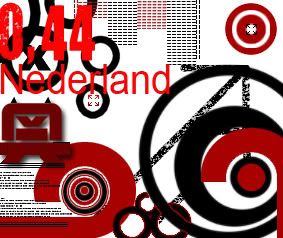
Edited and bump.
V2 is up.
It's a bit empty though, might edit that.
_________________
<<banned from SRF for proof of botting. -SG>>
|
|
| Top |
|
|
|
SuicideGrl
|
Post subject: Posted: Tue Jun 12, 2007 2:09 pm |
|
| Retired Admin |
|
|
Joined: Jan 2006
Posts: 8004
Location: World of Warcraft
|
|
i really dig the style and the use of space. i still worry about the huge loss of detail when they are shrunk, but there's a lot going on, it's tasty and interesting, i think you have something great going.
have you shrunk them down to their proper size and viewed them, just to see what it'd look like? post them pls :)
_________________
Thx IceCrash for my awesome sig :)
SRF Name Change Policy
Having trouble accessing SRF?
dom wrote: RuYi wrote: Are you from outer space or something? He's from Jersey. Close enough.
|
|
| Top |
|
|
|
Snudge
|
Post subject: Posted: Tue Jun 12, 2007 2:58 pm |
|
| Banned User |
|
Joined: Jun 2006
Posts: 4200
Location:
|
SuicideGrl wrote: i really dig the style and the use of space. i still worry about the huge loss of detail when they are shrunk, but there's a lot going on, it's tasty and interesting, i think you have something great going. have you shrunk them down to their proper size and viewed them, just to see what it'd look like? post them pls I constantly do so, just to see wether that one brush or effect will be visible good. Or either the font is visible that way or not.
*goes to upload :o*
Edit;
As you'll notice really small details(Like some of the little X's and other details) are lost in the smaller version.
But for now I'm supposed to design them in the larger filesize. Ofcourse, I'm supposed to take the 'initial' size in consideration. But I'm not worrying about that, it's the quality that bothers me.
_________________
<<banned from SRF for proof of botting. -SG>>
|
|
| Top |
|
|
|
Rizla
|
Post subject: Posted: Tue Jun 12, 2007 4:55 pm |
|
| Ex-Staff |
|
|
Joined: Jun 2006
Posts: 1197
Location: Artist's Corner
|
|
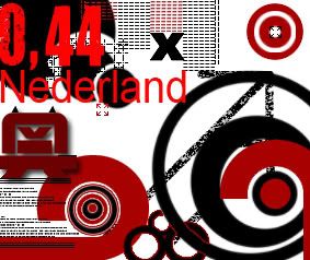
I cant read the ,44 on your red theme stamp. These are kickass though Snudge, great work...we may need to do a vector/raster collab here soon.
_________________
|
|
| Top |
|
|
|
Snudge
|
Post subject: Posted: Tue Jun 12, 2007 6:16 pm |
|
| Banned User |
|
Joined: Jun 2006
Posts: 4200
Location:
|
|
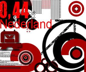
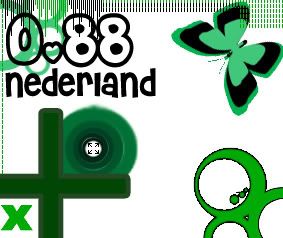
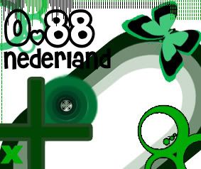
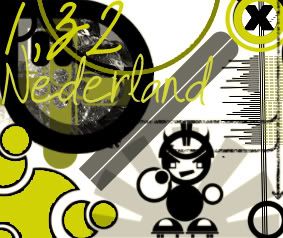
And stamp N° 3! This one seems a bit stuffed though. Gonna work on the 1st one(,44) now.
And I got a theme! Primary colours in their basic form.. Sounds odd enough to work! xD
But how am I going to explain that I didn't;
- Collect material as inspiration source for your theme.
- Make 1 or more 'collages'(Is that an english word as well? >.>) with the material you collected
- Collect a few different stamps or images of stamps
- Make a few sketches in which you try several ideas. (Think of the tekst as well)
To begin with.
=/
And now I'm starting to onder wether it was smart of me to pick 3 different fonts. >.>
_________________
<<banned from SRF for proof of botting. -SG>>
|
|
| Top |
|
|
|
Rizla
|
Post subject: Posted: Tue Jun 12, 2007 6:38 pm |
|
| Ex-Staff |
|
|
Joined: Jun 2006
Posts: 1197
Location: Artist's Corner
|
Snudge wrote: But how am I going to explain that I didn't; - Collect material as inspiration source for your theme. just make one a bit different than these, and say you collected it? ^^- Make 1 or more 'collages'(Is that an english word as well? >.>) with the material you collected
make something with the piece you made  - Collect a few different stamps or images of stamps google.com- Make a few sketches in which you try several ideas. (Think of the tekst as well) Um, do it?To begin with. =/ And now I'm starting to onder wether it was smart of me to pick 3 different fonts. >.> I like it.
_________________
|
|
| Top |
|
|
|
Snudge
|
Post subject: Posted: Tue Jun 12, 2007 6:44 pm |
|
| Banned User |
|
Joined: Jun 2006
Posts: 4200
Location:
|
|
And here goes a fix'd version 1!
_________________
<<banned from SRF for proof of botting. -SG>>
|
|
| Top |
|
|
|
Rizla
|
Post subject: Posted: Tue Jun 12, 2007 6:58 pm |
|
| Ex-Staff |
|
|
Joined: Jun 2006
Posts: 1197
Location: Artist's Corner
|
|
much better, but nederland on both your red/green versions have sections that are unreadable.
_________________
|
|
| Top |
|
|
|
SuicideGrl
|
Post subject: Posted: Tue Jun 12, 2007 7:07 pm |
|
| Retired Admin |
|
|
Joined: Jan 2006
Posts: 8004
Location: World of Warcraft
|
|
actually, they retain quite a bit of their detail at small size. very nice man.
_________________
Thx IceCrash for my awesome sig :)
SRF Name Change Policy
Having trouble accessing SRF?
dom wrote: RuYi wrote: Are you from outer space or something? He's from Jersey. Close enough.
|
|
| Top |
|
|
|
Snudge
|
Post subject: Posted: Tue Jun 12, 2007 7:12 pm |
|
| Banned User |
|
Joined: Jun 2006
Posts: 4200
Location:
|
|
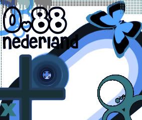
I added a blue version of the green one, because.. well... the primary colors are Red, Blue and Yellow ^^'
Which do you prefer?
And Rizla, I wouldn't have a clue how to fix that, besides adding a gradient. I don't want to add a gradient though, kills the entire 'vector feeling'.
_________________
<<banned from SRF for proof of botting. -SG>>
|
|
| Top |
|
|
|
|
Page 1 of 1
|
[ 28 posts ] |
|
Who is online |
Users browsing this forum: No registered users and 9 guests |
|
You cannot post new topics in this forum
You cannot reply to topics in this forum
You cannot edit your posts in this forum
You cannot delete your posts in this forum
You cannot post attachments in this forum
|
|


