|
|
Silkroad Online
|
|
|
Silkroad Forums
|
|
|
Affiliates
|


|
|
View unanswered posts | View active topics
  |
Page 1 of 1
|
[ 14 posts ] |
|
| Author |
Message |
|
Avalanche
|
Post subject: the most simple sig, evar!  Posted: Posted: Sat Jun 09, 2007 5:54 pm |
|
| Site Contributor |
 |
 |
Joined: Jan 2006
Posts: 3606
Location:

|
|
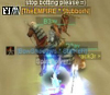
i hate sigs with too much going on/too many layers.
rate
|
|
| Top |
|
 |
|
satman83
|
Post subject: Posted: Sat Jun 09, 2007 5:55 pm |
|
| Site Contributor |
 |
|
Joined: Oct 2006
Posts: 9541
Location: London
|
|
| Top |
|
|
|
Dystopia
|
Post subject: Posted: Sat Jun 09, 2007 6:07 pm |
|
| Advanced Member |
 |
|
Joined: Jan 2007
Posts: 2317
Location:

|
|
Too little effort, just a vertical gradient, and render was probably blured and overlayed? Too simple,, 6/10
_________________
|
|
| Top |
|
|
|
Rizla
|
Post subject: Posted: Sat Jun 09, 2007 7:54 pm |
|
| Ex-Staff |
 |
|
Joined: Jun 2006
Posts: 1197
Location: Artist's Corner
|
|
6.5/10
Its not about simplicity really, you could still keep it very simple and improve on it. Remove that gradient (not cause "its just a linear gradient") because its not matching the light sources hitting your focal. Drop in a nice custom background, you could just smudge that gradient a bit and it would look just fine, you selected good colors. You have an awesome opportunity for light that can be accomplished on about 3 layers, add in a global light behind your subject, as he is getting splashed by it, and a smaller blue hue spot light near his front/left side (his right) and bingo, 9/10.
_________________

|
|
| Top |
|
|
|
Avalanche
|
Post subject: Posted: Sat Jun 09, 2007 8:44 pm |
|
| Site Contributor |
|
|
Joined: Jan 2006
Posts: 3606
Location:
|
Rizla wrote: 6.5/10
Its not about simplicity really, you could still keep it very simple and improve on it. Remove that gradient (not cause "its just a linear gradient") because its not matching the light sources hitting your focal. Drop in a nice custom background, you could just smudge that gradient a bit and it would look just fine, you selected good colors. You have an awesome opportunity for light that can be accomplished on about 3 layers, add in a global light behind your subject, as he is getting splashed by it, and a smaller blue hue spot light near his front/left side (his right) and bingo, 9/10.

|
|
| Top |
|
|
|
Rizla
|
Post subject: Posted: Sat Jun 09, 2007 8:51 pm |
|
| Ex-Staff |
|
|
Joined: Jun 2006
Posts: 1197
Location: Artist's Corner
|
let us see a hint of that blue light in the corner, we realize its hitting him yes, but we dont get to see it, to realize it, smudge out some of the background, your focal is the character, not whats around him, the background looks too....unaltered perhaps. grab a cool brush and just do some simple brushwork on it, like I said I was diggin those colors you had before, I dont know why you got rid of them QQ 
_________________
Last edited by Rizla on Sun Jun 10, 2007 1:41 am, edited 2 times in total.
|
|
| Top |
|
|
|
Avalanche
|
Post subject: Posted: Sat Jun 09, 2007 9:59 pm |
|
| Site Contributor |
|
|
Joined: Jan 2006
Posts: 3606
Location:
|
|
hm what you mean a hint of blue, you mean another light source?
|
|
| Top |
|
|
|
Rizla
|
Post subject: Posted: Sat Jun 09, 2007 10:44 pm |
|
| Ex-Staff |
|
|
Joined: Jun 2006
Posts: 1197
Location: Artist's Corner
|
this is what I had in mind, smudged that background, made the blue visible to all, and intensified the orang-y light source. I blurred with a gaussion blur where I smudged, then erased at 20% opacity outward from his body (to gain a bit more depth clear in the front, blur intensifies as your eyes travel back) then I applied the image to a new layer (image ->apply image) and filter->sharpened twice, then I erased on that top layer where I didnt want the sharpness to be, voila. Three layers (on top of yorus), simple. Obviously this render isnt perfect, I wasnt trying to do your sig for you (blur on the gun, etc) I just wanted you to be able to visualize what I was suggesting.
I had to stop myself because I wanted to add heatwaves coming off his shoulders/etc.. thats a good stock to work with 
If Im stepping on your toes, let me know asap and I will take this down. I also have the PSD if you want to see what I did for yourself.

_________________
|
|
| Top |
|
|
|
Avalanche
|
Post subject: Posted: Sat Jun 09, 2007 10:59 pm |
|
| Site Contributor |
|
|
Joined: Jan 2006
Posts: 3606
Location:
|
|
ohh, I see. I'll fix it later.
|
|
| Top |
|
|
|
Avalanche
|
Post subject: Posted: Sun Jun 10, 2007 12:02 am |
|
| Site Contributor |
|
|
Joined: Jan 2006
Posts: 3606
Location:
|
|
oh btw, i made the render :p
I make all my own renders, I believe copying someone else's render is the same thing as copying a sig.
If you want I can send you the stock render
|
|
| Top |
|
|
|
exality
|
Post subject: Posted: Sun Jun 10, 2007 12:14 am |
|
| Loyal Member |
 |
|
Joined: Mar 2007
Posts: 1802
Location: Fuck if i know
|
|
double post ftl
_________________


|
|
| Top |
|
|
|
shadowman20875
|
Post subject: Posted: Sun Jun 10, 2007 12:46 am |
|
|
|
|
lol, render, grandient, text, done
6.5/10
simplicity=superiority
-pts for whatever happened to his upper face
|
|
| Top |
|
|
|
|
Page 1 of 1
|
[ 14 posts ] |
|
Who is online |
Users browsing this forum: No registered users and 4 guests |
|
You cannot post new topics in this forum
You cannot reply to topics in this forum
You cannot edit your posts in this forum
You cannot delete your posts in this forum
You cannot post attachments in this forum
|
|


