agreed on what hejsan said. better you put the text somewhere on the left
of the focal (like above left) and make it blend in. you could try putting
the text layer on "soft light" and duplicating that 2 times.
for the rest, i miss something of a light source. i see the front of the
spaceship thing is lighter than the rear, but you might want to accentuate
that. if you fix the lighting and bring more light/dark contrast into the
piece, you will also gain some depth.
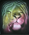
edit: i really liked it tho, and i tried out a couple of things with it.
this is what i came up with:

i also uploaded the .psd
http://www.sendspace.com/file/fxh88cjust a couple of little things i did to it, you can check out the .psd and
perhaps find out some new things ;] not saying my version is the optimal
version, but i tried to add some depth and some lighting :]