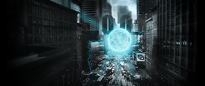
Slightly to dull for my taste, try to add some more contrast and try not to blend in your render as much as you did in this.
The focalpoint is all messed upp due to the fact that you have two renders far away from eachother, id say just get rid of the render to the left and add some effects around the render in the middle.
You could also add some shadows or darker areas in the edges of the sig, that would move the focal more to the center and it wouldnt look so bland.
Depth, at the moment there is none but you could blur the backround and maybe sharpen the render which would enhance the focalpoint even more. Adding a lightsource is also a great way to add depth and focal.
Now for the text, I actually dont think the text is all that bad, all you need to do is to make the text somewhat smaller and move it closer to the render, the actuall composition of the text is quite good in my eyes.
I guess thats pretty much it.

-0l3n


