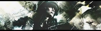
Nice one ^^ I like how you colored a bit in but its still monotone. The one thing I have to say about your sigs is that you don't have a well controlled light source. Ususually in reality light fades away with distance but that's not how it is on your sigs. The rest is self explanatory I guess <3
And for final adjustments, this is what I got off another gfx site. This thread is like my favorite and I viewed it so many times. These thigs are what I usually do when I have a strong focal.
Quote:
1-Gaussain Blur your backround
2-Sharpen your focal
3-use the burn tool for distance things
4-B&W Gradient on Lumonsity and erase some parts
5-applying your image, and then putting it on multiply to about 20% opacity or around there, until it looks good
6-i use the hue/saturation adjustment and set the saturation on -15 and set the layer to soft light
7.apply image, ur burn tools, sharpen, and blur the background. (only with HQ stock)
8.You can also take your original stock [scaled down to what it is in the sig] and put it on top of everything and set it to multiply and erase some parts.
9.You have a render that is mainly blue
You add it to a red background (with a red light source)
Take out a red soft brush and brush where the red light source would hit your render.
Set this layer to Soft Light.
It adds depth and makes it 'feel' like the render was always apart of the stock
10.Apply image, high pass on 10, set it on soft light. Great way to make depth
11. B+W Gradient map on multiply, Lower Opacity to about 20-30.
_________________
DID YOU KNOW? Milly has retired!!!!
Status: Into Minecraft