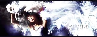
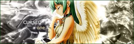
Thanks for the comments Holla. When i put a blueish gradient on Saturation it turned some parts pink/purple. I liked it at first but crashing colors like that is definitely a bad idea. So I urased the gradient from covering those parts. (And i didn't even know I can do that >.>)
The text is not your favorite, not many ppl's favorite but it is going to stay. The Text in here is simple yet artistic and its 3D following the sig's atmosphere. I could have arranged some texts but everything I tried just looked flat. Though it IS kind of away from the focal, disrupting the flow, so I made it lighter. V4 is here.
Also it was impossible to sharpen this thing because it looks really nasty when I do. The original stock was in a super good quality but I've resized it few times, so that could be the problem.
_________________
DID YOU KNOW? Milly has retired!!!!
Status: Into Minecraft


