I like it, although I wish it had some more contrast in order to bring out the focal point. I'm not too great with crits on these types of sigs but I do definitely think you should make the yellowish lighting a bit less intense and maybe darken the area around the person in order to make him stand out more.
Just my opinion. I love how you made the words "Ol3n" go underneath the guy. That's a great effect.
Joined: Jun 2006 Posts: 1197 Location: Artist's Corner
Lighting has already been addressed, overall great composition, but I think that Pulp Fiction and glowy purty efffects arent super compatible. <-- that is a completely subjective comment too, so take it at face value. gj kiu!
Joined: Jun 2006 Posts: 1197 Location: Artist's Corner
0l3n wrote:
Nice to know its better now.
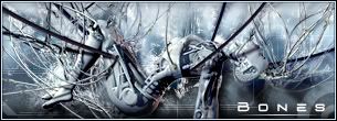
B/W is 5x better imo. It cancels the warm feeling given by the color.
Pulp Fiction is a very gritty movie, it doesnt beat around the bush - a guy gets his head blown off accidentally in the backseat of a car and the driver/passenger are more pissed about the car than the guy. One guy gets raped in the basement of a hillbillies pawnshop, where a sword killing also ends up taking place, etc. So the warm lights and soft feeling made me feel like...wtf?
v 1 is the best for sure, the color gives it a perfect focal point, other wise my eyes wander,
the v1 and maybe v2 (i like 1 a bit better)
is so nice, i look at it and it catches my eye as a scroll through teh page and is just all nice overall, great sig, get rid of v3 put it in ur current
Users browsing this forum: No registered users and 7 guests
You cannot post new topics in this forum You cannot reply to topics in this forum You cannot edit your posts in this forum You cannot delete your posts in this forum You cannot post attachments in this forum