|
|
Silkroad Online
|
|
|
Silkroad Forums
|
|
|
Affiliates
|


|
|
View unanswered posts | View active topics
  |
Page 1 of 1
|
[ 6 posts ] |
|
| Author |
Message |
|
HyorunmarouZ
|
Post subject: I made a new sig...  Posted: Posted: Wed Jun 13, 2007 2:01 am |
|
| Loyal Member |
 |
 |
Joined: Mar 2007
Posts: 1839
Location: Hell.
|
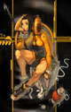
Hi, well... i'm not a skilled Photoshop user, in fact i barely spend time on looking at the tools.
But i've been rading ol3n's tut and thought i should try making a sig. This is what came up, guided by the tut, but not following exactly 
Don't be harsh, i know it's not perfect but oh well... i liked it and wanted to know if you liked it too 

Last edited by HyorunmarouZ on Wed Jun 13, 2007 2:12 am, edited 1 time in total.
|
|
| Top |
|
 |
|
cin
|
Post subject: Posted: Wed Jun 13, 2007 2:11 am |
|
|
|
imo, the render should fit in the background somewhat better. it now seems
as if he is floating in the air and is doing that in front of the background.
perhaps you can also adjust the lighting a bit (i always have problemw with
lighting thats why i make simple sigs like the puss); try put a light source
on it somewhere.
last, the txt. no comment 
BUT i do like the bg and the render is nice. just try to make us think they
belong together.
|
|
| Top |
|
|
|
HyorunmarouZ
|
Post subject: Posted: Wed Jun 13, 2007 2:17 am |
|
| Loyal Member |
|
|
Joined: Mar 2007
Posts: 1839
Location: Hell.
|
cin wrote: imo, the render should fit in the background somewhat better. it now seems as if he is a she hehe is floating in the air and is doing that in front of the background. The position of both wasn't the adequate... and i'm not sure how to place them together correctlyperhaps you can also adjust the lighting a bit (i always have problemw with lighting thats why i make simple sigs like the puss); try put a light source on it somewhere. Hehe this kind of comments were the reason i said "i barely spend time looking at the tools"  if i knew how to do that i would, but to be honest i'm no artist, i just tried to join a good background with my char i'll try, however, to find a way to achieve that "union". if i knew how to do that i would, but to be honest i'm no artist, i just tried to join a good background with my char i'll try, however, to find a way to achieve that "union".last, the txt. no comment BUT i do like the bg and the render is nice. just try to make us think they belong together.
|
|
| Top |
|
|
|
cin
|
Post subject: Posted: Wed Jun 13, 2007 2:23 am |
|
|
|
HyorunmarouZ wrote: cin wrote: imo, the render should fit in the background somewhat better. it now seems as if he is a she hehe is floating in the air and is doing that in front of the background. The position of both wasn't the adequate... and i'm not sure how to place them together correctlyperhaps you can also adjust the lighting a bit (i always have problemw with lighting thats why i make simple sigs like the puss); try put a light source on it somewhere. Hehe this kind of comments were the reason i said "i barely spend time looking at the tools" if i knew how to do that i would, but to be honest i'm no artist, i just tried to join a good background with my char i'll try, however, to find a way to achieve that "union".last, the txt. no comment BUT i do like the bg and the render is nice. just try to make us think they belong together. cool. just try spend a little time on it; its a nice sig to start off with and it
looks like its well editable
also, try to resize it as in chopping a bit off your top/bottom to get it into
a more "sig-sized" sig. <- you dont have to or something.. thats just my
personal taste i like sigs to all have about the same sizes
i normally take 425width and 125height. round 450x150 when i put in a loose
render like puss.
edit: and i know its not the best sig yet. but neither are any of mine. i like
em anyways
|
|
| Top |
|
|
|
Dystopia
|
Post subject: Posted: Wed Jun 13, 2007 4:17 am |
|
| Advanced Member |
 |
|
Joined: Jan 2007
Posts: 2317
Location:

|
|
Okay, these things you might want to consider
- Text
- Flow and movement
- Boarder
- Lighting
Text, It honestly looks like its drawn on paint pick a better font and dont place it near the edges, or on the focal point
Flow,I see you made some sort of shadow for the focal, you might want to make that linear so it looks like it belongs to the focal, and not just some blob. And it sort of looks plain for that size, add something that will add to its flow, or change the size to 340x120 or something around that
Boarder, Im not sure you might be better off without, but just try it to see which looks better
Lighting, You might want to add a source of light, or increase the power of the power-up thingy on your glavie...
_________________
|
|
| Top |
|
|
|
HyorunmarouZ
|
Post subject: Posted: Wed Jun 13, 2007 5:33 am |
|
| Loyal Member |
|
|
Joined: Mar 2007
Posts: 1839
Location: Hell.
|
IT wrote: Okay, these things you might want to consider
- Text
- Flow and movement
- Boarder
- Lighting
Text, It honestly looks like its drawn on paint pick a better font and dont place it near the edges, or on the focal point
Flow,I see you made some sort of shadow for the focal, you might want to make that linear so it looks like it belongs to the focal, and not just some blob. And it sort of looks plain for that size, add something that will add to its flow, or change the size to 340x120 or something around that
Boarder, Im not sure you might be better off without, but just try it to see which looks better
Lighting, You might want to add a source of light, or increase the power of the power-up thingy on your glavie...
I will try though i don't know how to use PS too well... and it's a two handed sword, not a glaive it's an euro char...
I thought it was plain too but ran out of ideas hehe i'll see if something comes to my mind later, i'm a bit tired now.
|
|
| Top |
|
|
|
|
Page 1 of 1
|
[ 6 posts ] |
|
Who is online |
Users browsing this forum: No registered users and 12 guests |
|
You cannot post new topics in this forum
You cannot reply to topics in this forum
You cannot edit your posts in this forum
You cannot delete your posts in this forum
You cannot post attachments in this forum
|
|


