|
|
Silkroad Online
|
|
|
Silkroad Forums
|
|
|
Affiliates
|


|
|
View unanswered posts | View active topics
  |
Page 1 of 1
|
[ 12 posts ] |
|
| Author |
Message |
|
HOLLAstir
|
Post subject: Attempt 2  Posted: Posted: Sun Dec 09, 2007 8:12 am |
|
| Loyal Member |
 |
 |
Joined: Aug 2007
Posts: 1637
Location: 206
|
|
| Top |
|
 |
|
Doron
|
Post subject: Posted: Sun Dec 09, 2007 1:09 pm |
|
| SRF's Princess |
 |
|
Joined: May 2007
Posts: 8570
Location: I'm at- Ooh something shiny!!
|
|
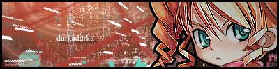
is it just me or did you made that guy pop out more?
_________________
|
|
| Top |
|
|
|
SuicideGrl
|
Post subject: Posted: Sun Dec 09, 2007 3:55 pm |
|
| Retired Admin |
 |
|
Joined: Jan 2006
Posts: 8004
Location: World of Warcraft
|
|
he pops a little too much for me, especially compared w/ your The Game sig.
however, i really like what you've done here. your text is especially tasty, i like how you have made it your own w/ the little touches.
i'm also a fan of how all your effect elements seem to be splattery and nondesticnt, rather than perfectly formed. wouldn't mind knowing what kinds of brushes you used, if any.
this one definitely is more... complete... than the other one somehow.
_________________

Thx IceCrash for my awesome sig :)
SRF Name Change Policy
Having trouble accessing SRF?
dom wrote: RuYi wrote: Are you from outer space or something? He's from Jersey. Close enough.
|
|
| Top |
|
|
|
WaX
|
Post subject: Posted: Sun Dec 09, 2007 4:02 pm |
|
| Banned User |
|
Joined: Sep 2007
Posts: 659
Location:

|
|
Its nice and the text is nice , but somthin with the pic thats jst not lookin right for me, but it might be just me lol
_________________
<<banned from SRF for bot admission. -SG>>
|
|
| Top |
|
|
|
fena
|
Post subject: Posted: Sun Dec 09, 2007 4:07 pm |
|
| Ex-Staff |
 |
|
Joined: May 2007
Posts: 4441
Location: Life
|
|
I love it, man. One of the nicest Sigs that I've seen around here in a while. I definitely like the color scheme - yellow and a light blue/turquoise - and the text looks awesome as well. Hollister seagull fits right into the spot where you placed it.
However, like everyone else said, your render still pops out a little bit. It's starting to look like you just slapped your render onto a background that you made beforehand, and then called it a day. Create depth, but not too much depth, that it's so blatantly obvious.
Another thing is your border. I'm not sure if I like that bright blue as a border. It's a bit too luminescent for me to put around the edge of your Sig.
Overall, it's a nice, nice Sig. 9/10 from me!
|
|
| Top |
|
|
|
HOLLAstir
|
Post subject: Posted: Sun Dec 09, 2007 8:08 pm |
|
| Loyal Member |
|
|
Joined: Aug 2007
Posts: 1637
Location: 206
|
SuicideGrl wrote: i'm also a fan of how all your effect elements seem to be splattery and nondesticnt, rather than perfectly formed. wouldn't mind knowing what kinds of brushes you used, if any.
The brushes are off deviantart. They are called Brushset002 and SpazzSplatter. There is one more but I can't remember which one it is. But thanks all for the comments, i'll work on my render looking more part of the sig rather then standing out so much <3
_________________


|
|
| Top |
|
|
|
BrokenSaint
|
Post subject: Posted: Mon Dec 10, 2007 9:21 am |
|
| Veteran Member |
 |
|
Joined: Jan 2006
Posts: 3473
Location: Stuntin'.
|
|
Your render needs to be blended in more. It's also a bit blurry.
_________________
|
|
| Top |
|
|
|
fena
|
Post subject: Posted: Tue Dec 11, 2007 1:53 am |
|
| Ex-Staff |
|
|
Joined: May 2007
Posts: 4441
Location: Life
|
durkadurka wrote: it looks the same to me... maybe thats cause im not as familiar with the little tricks as you all are, but i dont see a difference???
Don't see the difference between...
(Sorry, don't quite get what you mean, hehe)
|
|
| Top |
|
|
|
durkadurka
|
Post subject: Re: Attempt 2 Posted: Tue Dec 11, 2007 3:51 am |
|
| Common Member |
 |
|
Joined: Dec 2007
Posts: 101
Location:

|
HOLLAstir wrote: Messed around with two C4D's. Smudged and what not. Just trying to get used to everything again. Holla  between this one above and his sig one... oir is that not what yall are talking about... ? o.O
_________________

- 67 pure int spear nuker - xian - Death_2_ALL - gld ldr insane rage - 4 - 420 union -
- 45 pure int nuker s/s - pesodin -
|
|
| Top |
|
|
|
HOLLAstir
|
Post subject: Posted: Tue Dec 11, 2007 4:25 am |
|
| Loyal Member |
|
|
Joined: Aug 2007
Posts: 1637
Location: 206
|
|
There is no difference. They felt I needed to blend my render into the sig a bit more, and they are right, it could be blended better, i'm just lazy.
_________________
|
|
| Top |
|
|
|
|
Page 1 of 1
|
[ 12 posts ] |
|
Who is online |
Users browsing this forum: No registered users and 6 guests |
|
You cannot post new topics in this forum
You cannot reply to topics in this forum
You cannot edit your posts in this forum
You cannot delete your posts in this forum
You cannot post attachments in this forum
|
|


