Hostage wrote:
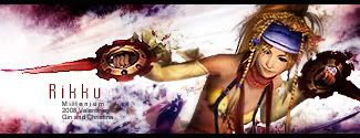
I really like this one, Mill. I just think the text spacing is just a little to far apart for " Rikku" because the font is to thin itself but that's just me. It looks wonderful especially the bg. Good job ^^8/10
Aw coming from you its such a wonderful compliment and it makes me happy ^^ I haven't forgot how my jaws literally dropped when I saw that music sig wars sig by you. It was like

but much bigger

Anyhow, the spacing is big I agree. I tried fatter fonts but i didn't look good. I tried putting Rikku without any spacings and it looked cluttered, so I ended up wth this. I actually like how its spaced out because I think it retains a good balance with the sig and the small text underneath. "Rikku" just looked too short and clumsy in there.
_________________
DID YOU KNOW? Milly has retired!!!!
Status: Into Minecraft


