|
|
Silkroad Online
|
|
|
Silkroad Forums
|
|
|
Affiliates
|


|
|
View unanswered posts | View active topics
  |
Page 1 of 1
|
[ 20 posts ] |
|
|
MrBow
|
Post subject:  Posted: Posted: Tue Dec 11, 2007 4:12 pm |
|
| Ex-Staff |
 |
 |
Joined: Jan 2007
Posts: 2979
Location: Playin' Talkin'
|
|
very nice, i specially like your brushes
_________________
Niyoke wrote: err i know ium soudning weird but .. Mr Bow is my p.e teacher .. ARE YOU MR BOW? LMAO ?
|
|
| Top |
|
 |
|
HOLLAstir
|
Post subject: Posted: Tue Dec 11, 2007 6:08 pm |
|
| Loyal Member |
 |
|
Joined: Aug 2007
Posts: 1637
Location: 206
|
|
There a reason for making them all 3 different sizes? Anyways their ok. Something about them that's just not grabbing me. The first one the render seems a bit small. Maybe it's just me. And your text, not feeling it. Don't like the 2nd one. Text on the 3rd one is better! idk theres just something about them. <3
_________________


|
|
| Top |
|
|
|
kate4231
|
Post subject: Posted: Tue Dec 11, 2007 10:25 pm |
|
| Common Member |
|
Joined: Oct 2007
Posts: 125
Location:

|
MrBow wrote: very nice, i specially like your brushes
don't use brushed i use smudged render for background and c4d's
thx for comments guys
_________________
name:_Xena
level: 71
build:70:70 bow fully farmed
Guild:Hard2Kill

|
|
| Top |
|
|
|
SuicideGrl
|
Post subject: Posted: Tue Dec 11, 2007 10:57 pm |
|
| Retired Admin |
 |
|
Joined: Jan 2006
Posts: 8004
Location: World of Warcraft
|
|
i think there's too much light and effects and not enough emphasis on the focal. that may be what hoola is feeling.
other than that, i think the composition is nice, but i would like to see your renders given more attention.
_________________

Thx IceCrash for my awesome sig :)
SRF Name Change Policy
Having trouble accessing SRF?
dom wrote: RuYi wrote: Are you from outer space or something? He's from Jersey. Close enough.
|
|
| Top |
|
|
|
HOLLAstir
|
Post subject: Posted: Tue Dec 11, 2007 10:59 pm |
|
| Loyal Member |
|
|
Joined: Aug 2007
Posts: 1637
Location: 206
|
SuicideGrl wrote: i think there's too much light and effects and not enough emphasis on the focal. that may be what hoola is feeling.
other than that, i think the composition is nice, but i would like to see your renders given more attention.
lol hoola! <3 <3 made me laugh. Anyways yeah agreed.
_________________
|
|
| Top |
|
|
|
thAi
|
Post subject: Posted: Wed Dec 12, 2007 4:58 am |
|
| Active Member |
 |
|
Joined: May 2007
Posts: 891
Location:

|
|
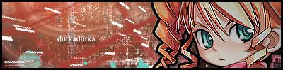
Like the third one.
_________________

|
|
| Top |
|
|
|
SuicideGrl
|
Post subject: Posted: Wed Dec 12, 2007 5:00 am |
|
| Retired Admin |
|
|
Joined: Jan 2006
Posts: 8004
Location: World of Warcraft
|
HOLLAstir wrote: SuicideGrl wrote: i think there's too much light and effects and not enough emphasis on the focal. that may be what hoola is feeling.
other than that, i think the composition is nice, but i would like to see your renders given more attention. lol hoola! <3 <3 made me laugh. Anyways yeah agreed. lol i totally didn't see that typo! whoops.
_________________
Thx IceCrash for my awesome sig :)
SRF Name Change Policy
Having trouble accessing SRF?
dom wrote: RuYi wrote: Are you from outer space or something? He's from Jersey. Close enough.
|
|
| Top |
|
|
|
HOLLAstir
|
Post subject: Posted: Wed Dec 12, 2007 5:01 am |
|
| Loyal Member |
|
|
Joined: Aug 2007
Posts: 1637
Location: 206
|
|
Hoolastir almost has a better ring to it anyways <3 lol
_________________
|
|
| Top |
|
|
|
SuicideGrl
|
Post subject: Posted: Wed Dec 12, 2007 7:25 am |
|
| Retired Admin |
|
|
Joined: Jan 2006
Posts: 8004
Location: World of Warcraft
|
HOLLAstir wrote: Hoolastir almost has a better ring to it anyways <3 lol

XD
not meant to be a serious piece, i just thought it'd be fun and funny.
_________________
Thx IceCrash for my awesome sig :)
SRF Name Change Policy
Having trouble accessing SRF?
dom wrote: RuYi wrote: Are you from outer space or something? He's from Jersey. Close enough.
|
|
| Top |
|
|
|
HOLLAstir
|
Post subject: Posted: Wed Dec 12, 2007 9:02 am |
|
| Loyal Member |
|
|
Joined: Aug 2007
Posts: 1637
Location: 206
|
SuicideGrl wrote: HOLLAstir wrote: Hoolastir almost has a better ring to it anyways <3 lol XD not meant to be a serious piece, i just thought it'd be fun and funny. omg hahaha wow that just made my night <3!
_________________
|
|
| Top |
|
|
|
kate4231
|
Post subject: Posted: Wed Dec 12, 2007 10:08 am |
|
| Common Member |
|
Joined: Oct 2007
Posts: 125
Location:
|
|
*BUMP* back on topic lol
_________________
name:_Xena
level: 71
build:70:70 bow fully farmed
Guild:Hard2Kill
|
|
| Top |
|
|
|
BrokenSaint
|
Post subject: Posted: Wed Dec 12, 2007 10:39 am |
|
| Veteran Member |
 |
|
Joined: Jan 2006
Posts: 3473
Location: Stuntin'.
|
you can try establishing a flow to your sigs. the ripple effect kinda ruins it however I like the beauty one alot. 
_________________
|
|
| Top |
|
|
|
kate4231
|
Post subject: Posted: Wed Dec 12, 2007 10:43 am |
|
| Common Member |
|
Joined: Oct 2007
Posts: 125
Location:
|
|
lmao so you noticed the ripple then xD yea i know i think im gonna take more times
_________________
name:_Xena
level: 71
build:70:70 bow fully farmed
Guild:Hard2Kill
|
|
| Top |
|
|
|
SuicideGrl
|
Post subject: Posted: Wed Dec 12, 2007 1:15 pm |
|
| Retired Admin |
|
|
Joined: Jan 2006
Posts: 8004
Location: World of Warcraft
|
kate4231 wrote: *BUMP* back on topic lol
sry :P
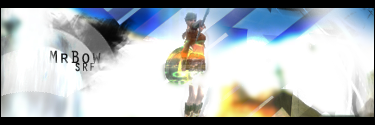
too much light. that remains my problem. the effects you use don't bother me; in fact i think they're creative. but for example, in the first one, your effects put off so much light that it completely washes out the render. it's like someone is shining their headlights in your eyes and you can't see their car properly.
_________________
Thx IceCrash for my awesome sig :)
SRF Name Change Policy
Having trouble accessing SRF?
dom wrote: RuYi wrote: Are you from outer space or something? He's from Jersey. Close enough.
|
|
| Top |
|
|
|
Faiien
|
Post subject: Posted: Wed Dec 12, 2007 2:22 pm |
|
| Active Member |
 |
|
Joined: Oct 2007
Posts: 889
Location:

|
SuicideGrl wrote: i think there's too much light and effects and not enough emphasis on the focal. that may be what hoola is feeling.
other than that, i think the composition is nice, but i would like to see your renders given more attention. +1
you need more focus on your render and less glowy effects
|
|
| Top |
|
|
|
Doron
|
Post subject: Posted: Wed Dec 12, 2007 6:06 pm |
|
| SRF's Princess |
 |
|
Joined: May 2007
Posts: 8570
Location: I'm at- Ooh something shiny!!
|
|
like them!
you did a great job with my sig and avvy, and those are evn better!
the text could be a bit more spread out though, and another letter type.. I want soething gracefull
_________________
|
|
| Top |
|
|
|
hitokiri
|
Post subject: Posted: Wed Dec 12, 2007 6:21 pm |
|
| Veteran Member |
 |
|
Joined: Feb 2006
Posts: 3503
Location: here
|
|
Third is my favorite out of the three. Little too much light as many say, cause 1st would rock if you eased it a little. The Text in the first two dont fit as well as the third one seems to with it, possibly play with other fonts?
Very nice over all though.
_________________

[Stealth] / [Ninjitsu] / [Relentless] /  [Scoundrels] [Scoundrels]
Troy / Pacific / Venus / Fembria / Salvation / Theta / Origin Online - Genesis
|
|
| Top |
|
|
|
durkadurka
|
Post subject: Posted: Wed Dec 12, 2007 7:53 pm |
|
| Common Member |
 |
|
Joined: Dec 2007
Posts: 101
Location:

|
|
note: those my opinion doesnt matter much cause im still a newbie on making shit, but here it is anyways...
first sig: digging the blue's of the piece. ive always been a fan of blues, the icy blues look good in it also, but the lught to me is a bit bright and it seems concentrated in the midddle of it.
though i do like how the light kinda engulfs the chicks head kinda. thats cool.
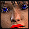
second sig: i think i see a character on the right side of it lol, but the massive explsion of lava takes away from the character... i do like the color how it changes from a darkness ( left ) to the brighter side of it ( right ) but like the one above it, the light is centered in the middle and is too bright in that spot.
third sig : really digging the bg as to be compared with the color of her hair. thats a good picture there. the text is ok, though i might have place it somewhere else ... ( and in that, would have posted here and yall would have said that the placement was bad .. so take this comment with a grain of salt LMAO ) .. when the others said the light was off on this one i partially agree with that. the light on the chik in the middle is good to me, though the light on either side of her shining in the bg brushes or w/e, is a bit off. maybe like a light source randomly not so random ...
all in all. the first sig is my fav ^^ Great job !! XD
_________________
- 67 pure int spear nuker - xian - Death_2_ALL - gld ldr insane rage - 4 - 420 union -
- 45 pure int nuker s/s - pesodin -
|
|
| Top |
|
|
|
SuicideGrl
|
Post subject: Posted: Wed Dec 12, 2007 8:56 pm |
|
| Retired Admin |
|
|
Joined: Jan 2006
Posts: 8004
Location: World of Warcraft
|
durkadurka wrote: note: those my opinion doesnt matter much cause im still a newbie on making shit, but here it is anyways...
completely untrue. you don't have to be a master to have an opinion XD
...nd the render in the first sig is a guy, i believe... from FFVII: Advent Children if i am not mistaken.
_________________
Thx IceCrash for my awesome sig :)
SRF Name Change Policy
Having trouble accessing SRF?
dom wrote: RuYi wrote: Are you from outer space or something? He's from Jersey. Close enough.
|
|
| Top |
|
|
|
|
Page 1 of 1
|
[ 20 posts ] |
|
Who is online |
Users browsing this forum: No registered users and 7 guests |
|
You cannot post new topics in this forum
You cannot reply to topics in this forum
You cannot edit your posts in this forum
You cannot delete your posts in this forum
You cannot post attachments in this forum
|
|