|
|
Silkroad Online
|
|
|
Silkroad Forums
|
|
|
Affiliates
|


|
|
View unanswered posts | View active topics
  |
Page 1 of 1
|
[ 18 posts ] |
|
| Author |
Message |
|
Dystopia
|
Post subject: NSR ~ Scarlett Johansson <3  Posted: Posted: Sun Jun 24, 2007 7:29 am |
|
| Advanced Member |
 |
 |
Joined: Jan 2007
Posts: 2317
Location:

|
1st time using "NSR" 
Thanks Elikapeka for the name 
Here is the results:
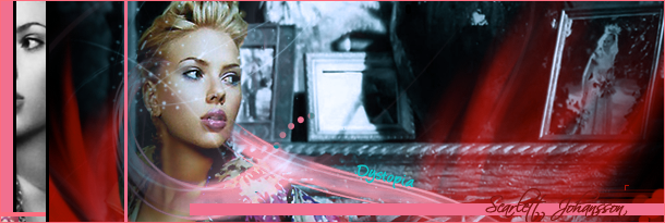
This is what 1st came out at the end but then I realized the left side is a little busy while the right side is empty + the 2 faces looking away from eachother gave it a rather nasty feel and I was aiming for glamour.
So the second version is..
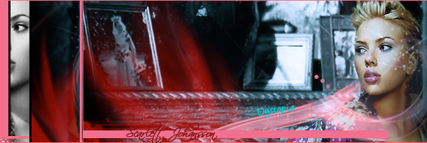
It's a bit too big for a sig at 610x205, so like a mini-LP
It would be nice if some one could tell me how to resize it without distorting it or leaving excess white areas
C/C, Comments and -/10 plz
_________________
|
|
| Top |
|
 |
|
ElMejorGlavie
|
Post subject: Posted: Sun Jun 24, 2007 10:02 am |
|
| Active Member |
 |
|
Joined: Apr 2007
Posts: 577
Location:

|
Very nice, yeah a bit too big for a siggy but she is very pretty and you've complimented her 9/10
_________________

IGN: xPaynex
Server: Oasis
Lvl: 6X
Guild: Oathkeepers
|
|
| Top |
|
|
|
BrokenSaint
|
Post subject: Posted: Sun Jun 24, 2007 10:06 am |
|
| Veteran Member |
 |
|
Joined: Jan 2006
Posts: 3473
Location: Stuntin'.
|
|
9/10
Very nice. Just a small adjustment to the fire effect would be nice. Maybe rotate a little to the side to fit the flow. Just my opinion anyways, but I'm always looking for the small details.
_________________
|
|
| Top |
|
|
|
Rizla
|
Post subject: Posted: Sun Jun 24, 2007 1:22 pm |
|
| Ex-Staff |
 |
|
Joined: Jun 2006
Posts: 1197
Location: Artist's Corner
|
|
number 1
6.5 or 7/10 not sure.
The red is a bit deep, her name doesnt contrast well with the band behind it, and I think you should take your name out (its not a sig) use a watermark or something if your eally feel the need to have your name on it.
_________________

|
|
| Top |
|
|
|
nightbloom
|
Post subject: Posted: Sun Jun 24, 2007 5:56 pm |
|
| Banned User |
|
Joined: Jan 2006
Posts: 5492
Location:

|
|
Im not a fan of the text... I always think its a mistake to try to and make the text blend into the pic. It cant, its text.
Other than that, I like #1. Too much balance or symmetry doesnt always look better, ppl get too afraid of empty spaces. I like it bunched over to the side.
_________________
<<banned from SRF for rules violations: being a constant problem. -SG>>
|
|
| Top |
|
|
|
shadowman20875
|
Post subject: Posted: Sun Jun 24, 2007 6:32 pm |
|
|
|
|
The text of your name is ruining the whole thing for me, it has become my focal point for the whole thing, I can't help starring at it.
I like that fact that you did a large picture to fit a lot more stuff in there, but Scarlett and the background is too similar, either darken the back more or brighten the render.
You could do with some opacity too, some of the color is just, there.
7/10 I still like it though, looks like you spent a good amount of time of it.
|
|
| Top |
|
|
|
Dystopia
|
Post subject: Posted: Sun Jun 24, 2007 7:03 pm |
|
| Advanced Member |
|
|
Joined: Jan 2007
Posts: 2317
Location:
|
|
I see what you mean, my name kinda does take away from the focal, so i should take that off, but I dont know about her name, I like it. I should lower the opacity on the red "flames" and fill up the empty space with a brush or two. And should I move the "scarlett johansson" text abit closer to her so it wouldnt distract away from the focal? Should I do all this?
_________________
|
|
| Top |
|
|
|
shadowman20875
|
Post subject: Posted: Sun Jun 24, 2007 7:11 pm |
|
|
|
|
Well her name is on a solid block of pink, which is the exact opposite of the elegance of your text, flames (which I thought was silk or something at first), and the render.
I realize that the pink is a repetition of the border, but in the middle of the image without any opacity and stretching all across the picture kind of ruins the.... what do they call it? flow I think, I never cared about that but it is just distracting to me.
The pink bar could do with some effects, especially at the end to make it fit in better with the whole thing.
Edit: If you like that pink bar with her name, I suggest maybe making it smaller. As for moving the text closer to her, it doesn't matter as it is a nice balance to the two faces on the other side.
|
|
| Top |
|
|
|
Doron
|
Post subject: Posted: Sun Jun 24, 2007 8:02 pm |
|
| SRF's Princess |
 |
|
Joined: May 2007
Posts: 8570
Location: I'm at- Ooh something shiny!!
|
|
I love it, it is a great sig. only some points..
those flames look just like curtains,
the red-ice bleu contrast is incredibly cool
the bar with the name on it may be a bit smaller
the first one is better because they look diferent ways,
Her name could be jumping out more.
with these points it would look absoluely great, and your name on the flow is great, like it is sliding from bleu to red
( my specialty is color and inmagination..)
_________________
|
|
| Top |
|
|
|
Dystopia
|
Post subject: Posted: Sun Jun 24, 2007 8:10 pm |
|
| Advanced Member |
|
|
Joined: Jan 2007
Posts: 2317
Location:
|
|
I said flame like I wasn't intended to look life flames I just like the addition. I can make the pink bar with her name on it smaller and give it a warmer photofilter...
_________________
|
|
| Top |
|
|
|
Doron
|
Post subject: Posted: Sun Jun 24, 2007 8:22 pm |
|
| SRF's Princess |
|
|
Joined: May 2007
Posts: 8570
Location: I'm at- Ooh something shiny!!
|
|
well, the name doesn't really comes out of the picture with it's red in front of the red flames/curtains. if you would make that pink too or something, everyone would see inmedietly that it's scarlett, and it'll make it nicer too, i think
_________________
|
|
| Top |
|
|
|
pherball
|
Post subject: Re: NSR ~ Scarlett Johansson <3 Posted: Sun Jun 24, 2007 10:10 pm |
|
| Valued Member |
|
Joined: Jul 2006
Posts: 398
Location:

|
Dystopia wrote: excess white areas
Explains your sig well.. 
_________________

|
|
| Top |
|
|
|
Noureddin
|
Post subject: Posted: Mon Jun 25, 2007 12:17 am |
|
| New Member |
|
Joined: Jun 2007
Posts: 34
|
|
3/5
blond's
Good - Hot, Good at sex, And did I mention hot?? lol
Bad- Stupid, Annoying, Emo
Over all. Blonds SUX
|
|
| Top |
|
|
|
Doron
|
Post subject: Posted: Mon Jun 25, 2007 4:21 pm |
|
| SRF's Princess |
|
|
Joined: May 2007
Posts: 8570
Location: I'm at- Ooh something shiny!!
|
|
lovv Scarlett..
Btw. wasn't she in Grey's Anatomy/ie and that movie of 2 sisters who switch bodies?
_________________
|
|
| Top |
|
|
|
skulldiver
|
Post subject: Posted: Sun Jul 01, 2007 11:32 am |
|
| Active Member |
 |
|
Joined: Mar 2007
Posts: 787
Location: The netherlands
|
|
jep, shes in greys anatomy, called izzy(or something like that)
_________________
Quote: Shave a single hair....really? Just yank that pubic hair shit off your face.
Your mom made it sound like a phuckin bean stock is gonna start growing off your face and seek vengeance for cutting it.
|
|
| Top |
|
|
|
pyro93
|
Post subject: Posted: Sun Jul 01, 2007 11:56 am |
|
| Regular Member |
 |
|
Joined: May 2007
Posts: 227
Location:

|
here i resized it for u :s
400x137

_________________

Thank You HejsaN I Love it
|
|
| Top |
|
|
|
BrokenSaint
|
Post subject: Posted: Sun Jul 01, 2007 11:58 am |
|
| Veteran Member |
|
|
Joined: Jan 2006
Posts: 3473
Location: Stuntin'.
|
pyro93 wrote: here i resized it for u :s 400x137 EEK! Now we cant see the text. nice job lol. xD
_________________
|
|
| Top |
|
|
|
|
Page 1 of 1
|
[ 18 posts ] |
|
Who is online |
Users browsing this forum: No registered users and 8 guests |
|
You cannot post new topics in this forum
You cannot reply to topics in this forum
You cannot edit your posts in this forum
You cannot delete your posts in this forum
You cannot post attachments in this forum
|
|


