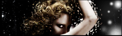
the points of light and color around her arms and hair have really hard edges. blurring them a bit will make it look less harsh. try duplicating the layer and adding a guassian blur to the duplicated one at like 0.7 radius, then jusy erase the parts of that layer over her face and hair to bring out those details (but be caredul to avoid the highlights we're TRYING to blur lol).
it'e pretty obvious that your light source is coming from the top right, as indicated by the shadow on her face. try adding a gradient fill transparent -> white going from the bottom left to the top right, chance the opacity of the layer to around 20%, and set it to overlay.
those two things would give you this:
(old):

hope that helps :)
<<edit: just noticed that my gradient kinda obscured the text in the lower right corner. that'd be easy to fix, just erase the gradient over it slightly.>>
_________________

Thx IceCrash for my awesome sig :)
SRF Name Change Policy
Having trouble accessing SRF?
dom wrote:
RuYi wrote:
Are you from outer space or something?
He's from Jersey. Close enough.