Silkroad Online Forums

A community forum for the free online game Silkroad Online. Discuss Silkroad Online, read up on guides, and build your character and skills.

Faq Search Members Chat  Register Profile Login

All times are UTC


Post new topic Reply to topic  [ 13 posts ] 
Author Message
 Post subject: Mariah Carey
PostPosted: Mon Apr 30, 2007 7:20 am 
Common Member
Offline

Joined: May 2006
Posts: 109
Well I was aiming for a bright looking sig, I fell like I accomplished that on this one.
Image
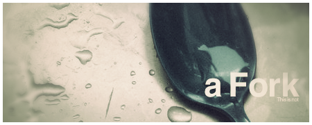
I tried doing the same for this sig, but some how went the opposite direction :?.
Image

_________________
My Album
Image


Top
 Profile  
 
 Post subject:
PostPosted: Mon Apr 30, 2007 7:23 am 
i like that 2nd one better.
the top one is near perfect, i just feel that not all
the colors match in that graph. therefore, there is
a weird focus on mariah cause her colors pop out
more already than the background.

id try either making the bottom part of mariah a bit
lighter or making the top part of mariah a bit darker
to focus on her in the sig instead of her boobs that
are below the sigs edge :)


Top
  
 
 Post subject:
PostPosted: Mon Apr 30, 2007 7:28 am 
Ex-Staff
User avatar
Offline

Joined: Dec 2006
Posts: 5607
Location: darkroot garden
top one 10/10 - ur giving me ideas :roll:

bottom one 7/10

_________________
Image
<3
0len


Top
 Profile  
 
 Post subject:
PostPosted: Mon Apr 30, 2007 7:59 am 
Site Contributor
User avatar
Offline

Joined: Oct 2006
Posts: 9541
Location: London
reK wrote:
top one 10/10 - ur giving me ideas :roll:

bottom one 7/10


yea aprat from the pic...i mean WTF is that hoe doing..she looks
retarded :roll:

7/10--- should of gotten a better pic, i mean where are the big boobies??? :x

_________________
Image


Top
 Profile  
 
 Post subject:
PostPosted: Mon Apr 30, 2007 11:00 am 
Forum Legend
User avatar
Offline

Joined: Jul 2006
Posts: 7885
Location: At the apple store, Cause i'm an iAddict.
1st 8/10

2nd 10/10

_________________
Image


Top
 Profile  
 
 Post subject:
PostPosted: Mon Apr 30, 2007 12:35 pm 
Active Member
Offline

Joined: Jan 2007
Posts: 787
Work on the flow and depth. The light is pretty good, needs a bit of work though.

You need to work ALOT on your colors and effects. I'm seeing the same compo again and again and again. You've got way too many mixed colors.

_________________
Image
XxYODAxX wrote:
Thank you Geedunk you are friggin awesome!

RuYi wrote:
Geedunk for president!! :D


Top
 Profile  
 
 Post subject:
PostPosted: Mon Apr 30, 2007 6:01 pm 
Banned User
Offline

Joined: Jan 2006
Posts: 5492
Location:
Venus
I liked the bright colors. Too many ppl make thier sigs dark and dismal looking.

Id give them both 8/10

_________________
<<banned from SRF for rules violations: being a constant problem. -SG>>


Top
 Profile  
 
 Post subject:
PostPosted: Mon Apr 30, 2007 6:41 pm 
Valued Member
User avatar
Offline

Joined: Mar 2006
Posts: 391
Location:
Pacific
Geedunk wrote:
Work on the flow and depth. The light is pretty good, needs a bit of work though.

You need to work ALOT on your colors and effects. I'm seeing the same compo again and again and again. You've got way too many mixed colors.


Dude shut the **** up and make something original you ******.

@KycoO both are very good, I like the vector brushes you use. Try to work on your text though, it's becoming repetitive. Kep it up on the images!

Try to mix up your styles too :)

_________________
Image
ArchLord | Fracture | 32 | MoonElf Ranger | notFALLIN
SilkRoad | Sunstyle | 42 | Str Fire Glaive | SuddenDeath (Retired for now)


Top
 Profile  
 
 Post subject:
PostPosted: Mon Apr 30, 2007 6:52 pm 
Active Member
Offline

Joined: Jan 2007
Posts: 787
Fracture wrote:
Geedunk wrote:
Work on the flow and depth. The light is pretty good, needs a bit of work though.

You need to work ALOT on your colors and effects. I'm seeing the same compo again and again and again. You've got way too many mixed colors.


Dude shut the **** up and make something original you ******.

@KycoO both are very good, I like the vector brushes you use. Try to work on your text though, it's becoming repetitive. Kep it up on the images!

Try to mix up your styles too :)


I made constructive critism - you didn't do jack.

_________________
Image
XxYODAxX wrote:
Thank you Geedunk you are friggin awesome!

RuYi wrote:
Geedunk for president!! :D


Top
 Profile  
 
 Post subject:
PostPosted: Mon Apr 30, 2007 7:39 pm 
Senior Member
User avatar
Offline

Joined: Nov 2006
Posts: 4526
Location: Life.
top, 8/10

bottom, 7/10, could maybe use a remix on the colors, giving it altitle more contrast.

_________________
Image
^Thanks 0l3n!
Gone. Never really gone, but never really here.
"If Pac-Man had affected us as kids, we’d all be running around in dark rooms, munching pills and listening to repetitive electronic music"


Top
 Profile  
 
 Post subject:
PostPosted: Mon Apr 30, 2007 8:16 pm 
Site Contributor
User avatar
Offline

Joined: Oct 2006
Posts: 9541
Location: London
Geedunk wrote:
Fracture wrote:
Geedunk wrote:
Work on the flow and depth. The light is pretty good, needs a bit of work though.

You need to work ALOT on your colors and effects. I'm seeing the same compo again and again and again. You've got way too many mixed colors.


Dude shut the **** up and make something original you ******.

@KycoO both are very good, I like the vector brushes you use. Try to work on your text though, it's becoming repetitive. Kep it up on the images!

Try to mix up your styles too :)


I made constructive critism - you didn't do jack.


lol which is really ironic, because hes acting and doing what you normaly
do when we give you critism :roll:

_________________
Image


Top
 Profile  
 
 Post subject:
PostPosted: Mon Apr 30, 2007 8:17 pm 
Active Member
User avatar
Offline

Joined: Apr 2007
Posts: 577
Location:
Oasis
they r reli good :)

_________________
Image

IGN: xPaynex
Server: Oasis
Lvl: 6X
Guild: Oathkeepers


Top
 Profile  
 
 Post subject:
PostPosted: Tue May 01, 2007 1:05 am 
Common Member
Offline

Joined: May 2006
Posts: 109
Thanks for the comments, and only the top one is Mariah Carey if anybody was wondering.

I wasn't so confident about the colors on the second one, I think someone mentioned it was to over contrasted, as for the text, it will always be garbage :D.

_________________
My Album
Image


Top
 Profile  
 
Display posts from previous:  Sort by  
Post new topic Reply to topic  [ 13 posts ] 

All times are UTC


Who is online

Users browsing this forum: No registered users and 13 guests


You cannot post new topics in this forum
You cannot reply to topics in this forum
You cannot edit your posts in this forum
You cannot delete your posts in this forum
You cannot post attachments in this forum

Search for:
Jump to:  
Powered by phpBB © 2000, 2002, 2005, 2007 phpBB Group