.Banshee wrote:
OMG is that the pentool you used on your first sig? I didn't get the pentool until my 8~10th sig. But your renders aren't blending in too well in the background. Try blur>layer to screen>new layer>apply image> layer to darken. Also text. Use simple text, fancy text takes away from from the sig, you'll have much more time to use fancy texts when your a master, but as of now focus on text placement. Speaking of text placement always place text a good bit away from the focuse but not too far away and when choosing text color try to use colors that don't contrast too much with the main colors, and if you do then lower the opacity of the text.
Dint use pentool yet ^^
And ups

the way i used my text is kind of the oposite of what you said ^^
Ill go fool around a bit again ^__^ see what i can do

Thnx for the help
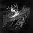
EDIT: think it blends a bit better like this ?
I set the new layer to overlay though, instead of Darken, imo it looked better ^^