Hostage wrote:
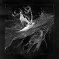
Yah, that's a great tutorial and you seemed to have done a good job with it. The pentooling around the "sword" thing seems unnecessary looks like you just threw it on for the sake of showing that you know how to do it. Not really adding to the whole appeal of the sig in general. Text is good but I would move it closer to the render and maybe make it a smaller font size. Also try bringing out the colour from the c4d how it is now is actually making the whole thing look dull colour wise and that's a hard thing to do when the sig is mostly cyan. xD
Other then that it was done well not much more I can say since I've seen the tut done many times so I'll leave it at that.

I taught it would give a supercool effect to the sword. Like he has a cool sword or something.
Kraq wrote:
o.o I think I have that render

Looks good cept the c4d thing seems like its oing everywhere, or it might be the brushing..
It's the brushing, as I said in the first place.
Thank you though.