magisuns wrote:
it really is basic 0o.
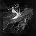
cropped it, resized it, gauss blur on a dupped layer, erased around the focal so it wasnt blurred ,some color balancing-contrast, then a brush to show movement? Am i rite Am i rite?

anyways i think it looks pretty good despite how basic it is. it would get a 70% from me.
its hard to rate other than for overall appearance though

Thanks. Just played with the tools. Seen which does what. This was more like experimental, but ok. Still, will make a few of these experimental ones, and not use a guide.
Hostage wrote:
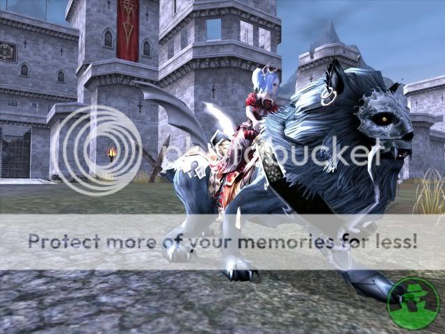
Your BG is over blurred and the lighting is bit harsh. I'd go with the B/W version simply because I like the contrast with the lion/ thing miggigy. Another thing nothing wrong with "basic" work just remember when you go this route your fundamentals will be judged more severely because there is nothing else to catch our eyes. So always pay attention to the small things like shading, lighting and colour.
I've noticed the overblurred BG a bit too late.

Will do.