When doing texts, i myself prefer to use small simple texts and i like to put them so they are near the focal point, but not blocking it.
The Art of War one looks pretty cool.
For #2, try adding a few more effects to it, you've done a couple, but just try doing some more next time, you can always delete a layer

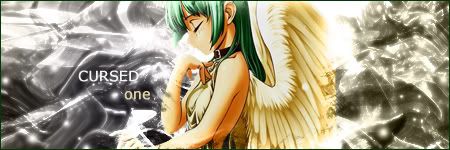
#3, The render seems over contrasted, sharpened, and it seems you used hue adjustments to turn it red. And the background seems to just be some pink clouds. You need to work on blending the render into the background, like you did with the previous sig.