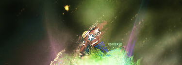
HOLLAstir wrote:
I like the colors, but thats about it. It's just too empty, and not a lot going on. Looks like it's 50% done at most. Add some more depth to it and have it more active. The biggest things sticking out to me are: The little red/orange c4d spot at the top, the two purple c4d's on either side of the bottom, and the BG itself. It has a solid base, but once my eyes looked further, the more I disliked it. I like how you stayed simple with the text, although maybe choose a different font or go under window>characters and space out the text a tad.
I disagree a bit with you, HOLLA. :]
I like Snudge's empty space, actually. In fact, I don't think it'd look good without the empty space. The black is in real sharp contrast to the render and the effects, and it stands out. Sometimes black + color doesn't look good, but I think this one is very tastefully done.
I think you have some good flow here too, Snudge, especially the effects you gave onto his hand punching downwards. And contrary to HOLLA again, I think your text is just awesome. Obscure, but noticeable. Yummy like an apple.
The only thing I'd like to point out is that I think your choice of colors could be improved a little - more of a color scheme. For example, your Victory sprite tag (with its purple and dark hues) was just awesome.
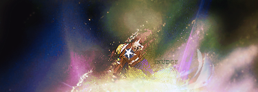
Other than that, I like V2 the best. And once again, another great sprite tag from Snudgey.
Apple apple! :]